05
Testing:
Experimenting with Making
~ 16.02.2025
Product and Experience
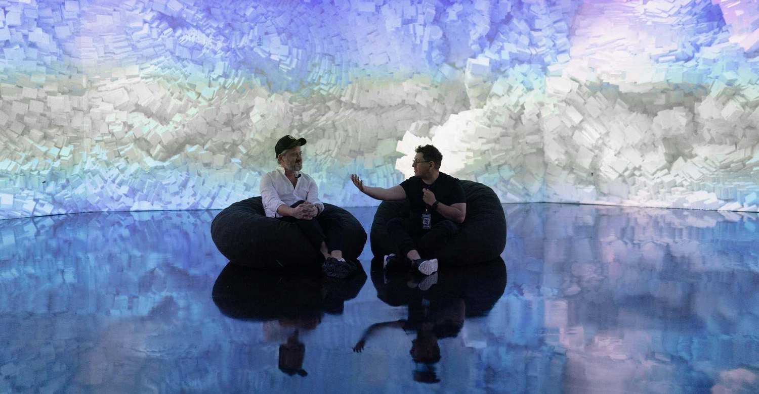
When I was around 16, I visited an immersive art exhibition in South Korea that showcased Van Gogh's paintings projected onto the walls of a dark room. I remember feeling a bit let down. The room was filled with people, but most seemed more interested in capturing the experience for their social media feeds than actually engaging with the art. They were taking videos, snapping pictures, and scrolling through their phones. The curated descriptions on the walls—which also most likely took multiple revisions in both content and layout—were barely glanced at. It felt more like a tourist pit stop.
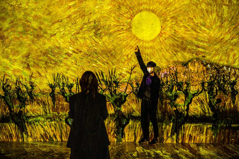
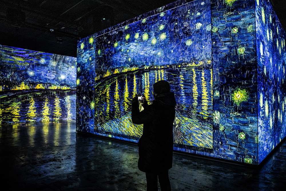
These days, whenever I see an exhibition marketing itself as "immersive," I can't help but feel sceptical. I've found more value in minimalist spaces where the layout of the artwork is the biggest priority. I assume this rise of immersive art exhibitions could be a reflection of a growing dissatisfaction with established art institutions. It seems the art world has become increasingly elitist and disconnected from the public, and works like Refik Anandol's addresses that frustration directly.
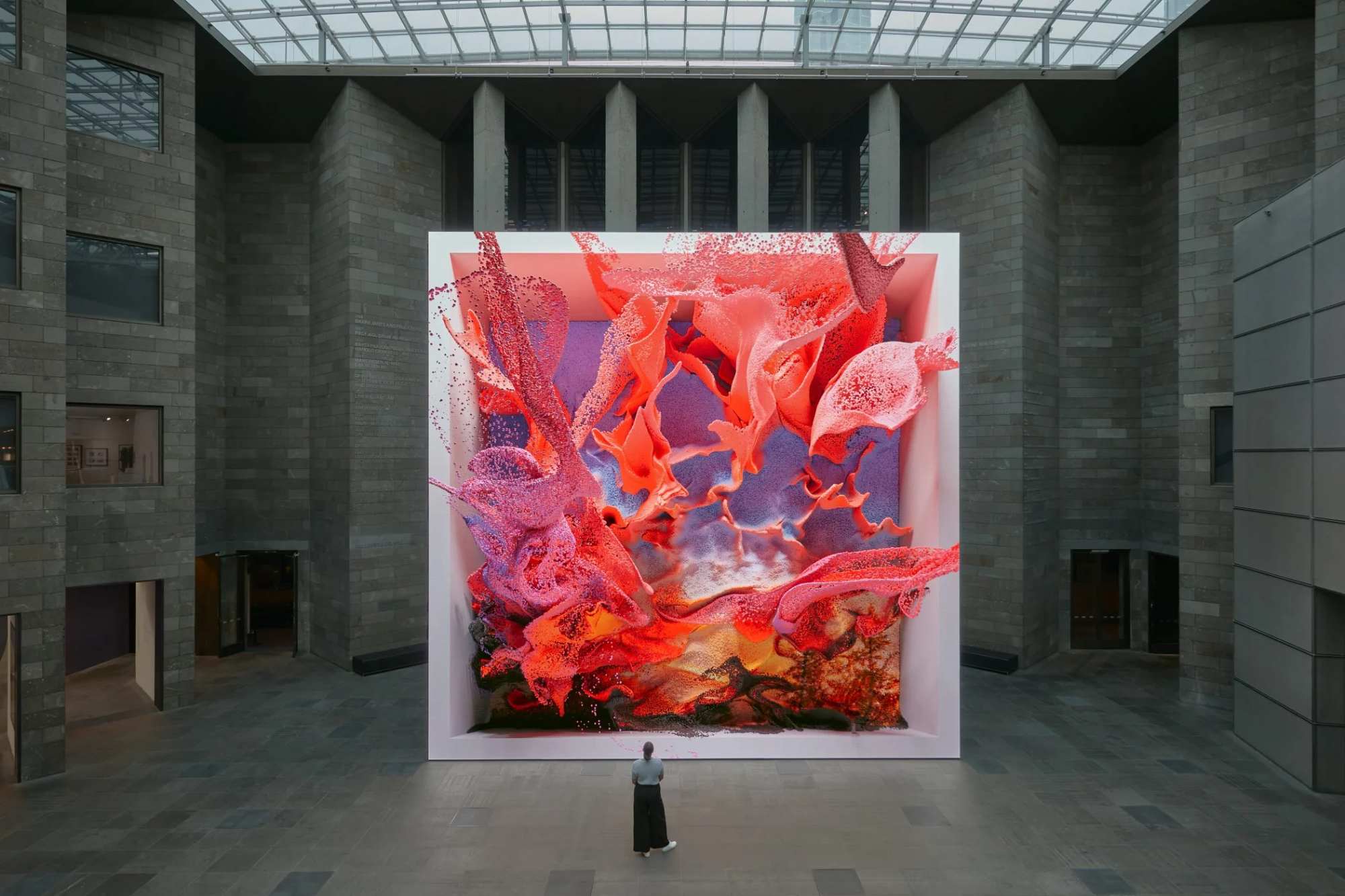
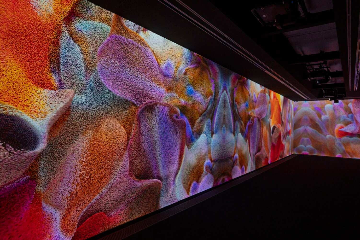
Anadol's work appears to align more with the interests of big-tech companies. Not all art needs to be deeply philosophical. In fact, I believe the biggest problem in the art and design world is the lack of genuine conceptual depth, often masked by the pretence of 'philosophy.' Many artists use unnecessary gimmicks, obscuring their work with vague narratives to seem profound. This creates a barrier to truly thoughtful and experimental practices.
Anadol's popularity is the opposite. While many see him as a refreshing alternative to the often inaccessible and overly commercialised art scene, his work tends to prioritise visual engagement over conceptual depth—more akin to a screensaver than a thought-provoking artwork. I once saw someone compare Anadol to Donald Trump, suggesting that both figures appeal to those who feel alienated by established norms. While the comparison was intended to highlight their status as disruptive outsiders, I think there is another parallel.
Just as one of the most basic appeal of Trump lies in his perceived honesty about dishonesty—since all politicians lie, at least he is upfront about it—Anadol's work offers a similar kind of transparency. I would say that people like me, who are tired of the lack of conceptual depth being masked by egotistic, self-delusional artists who obscure for the sake of obscuring, have led some within the creative industry to support Refik Anadol.
But I should remind myself of my original objective. While I am tired of artists who lack conceptual depth yet hide behind egotistic, self-delusional narratives, I still believe that work with a genuine, witty logic that obscures for the sake of entertainment should be the main principle of any creative practice. This growing focus on spectacle risks overshadowing more experimental and thoughtful practices. When public engagement with art is driven by immediate visual gratification, critical voices can become marginalised. This can lead to an environment where only the most superficial expressions gain traction, and a cultural landscape dominated by experiences that are designed for social media appeal.
Installations
I wonder whether my four interfaces—each a small, product-like object with a common theme—could be considered an installation. Because they are a concise whole of multiple outputs instead of several separate components that shape the environment. Reading about installation art, I've started to think it might be possible, but only if the interfaces work together to create a unified, immersive experience rather than feeling like separate, individual pieces.
Installation art is about crafting an environment or a complete experience that engages the viewer spatially, often inviting them to move through or interact with the space. What makes it different from sculpture or traditional art forms is the emphasis on creating a cohesive whole—something that surrounds the viewer and draws them in. As Ilya Kabakov put it, the viewer is the "main actor," the central focus of everything within the installation.
I know that to meet this standard, my interfaces need to do more than just share a visual or thematic connection. They need to transform the space into a cohesive environment. I'm imagining how I might use visual, auditory, or interactive elements to tie them together, ensuring that the viewer's experience feels intentional and complete. If each interface could offer a different sensory or conceptual layer, but all contribute to a single overarching concept, then maybe it could work as an installation.
Modeling
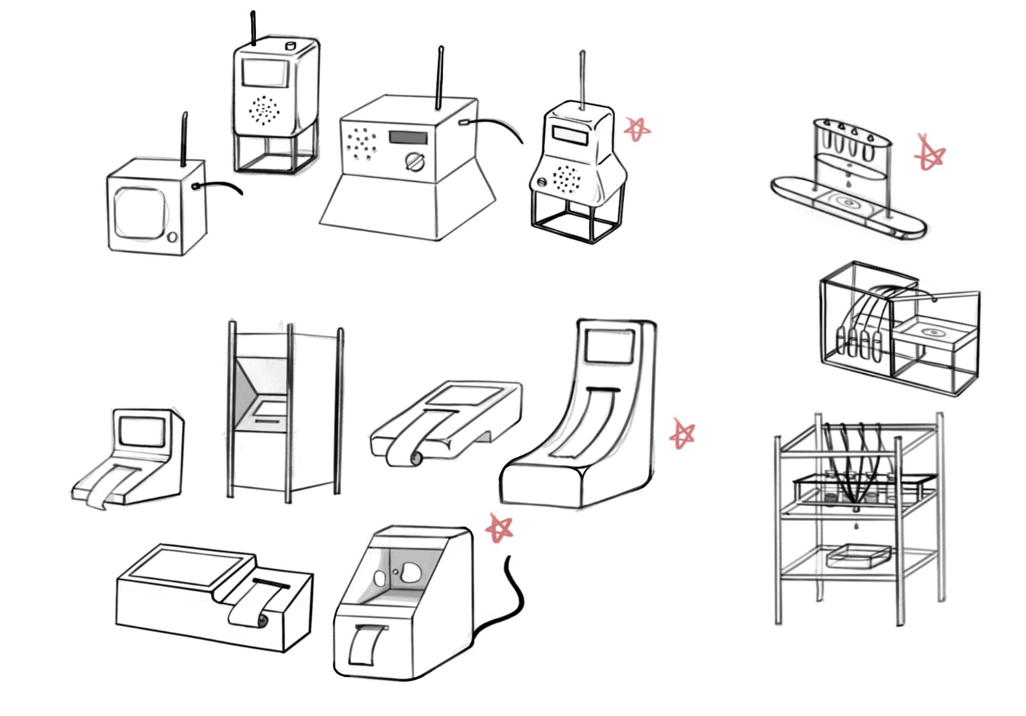
When I started sketching the radio interface, I took a freeform approach, guided by intuition rather than any strict principles. Rounded corners quickly became a recurring feature, reflecting rounded corners of the borders for images in my website and project collaterals. It also meant to avoid sharp, clean lines in favour of a vintage, 20th century computer-inspired look that complemented my project's visual identity. To make sure I was on the right track, I shared my sketches with peers, asking them to pick the most appealing designs. Even though I have some assumptions, getting grounded comments from the perspective of the user always helps priorities the considerations.
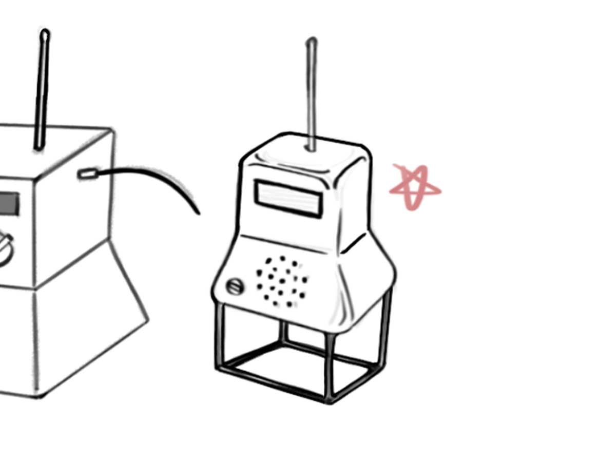
The basic considerations were functionality and practicality. I angled the speaker forward and slightly upward for clear sound projection and positioned the earphone jack on the side to prevent tangling of the cables. The display was slightly angled upwards for better visibility, even when not at eye level.
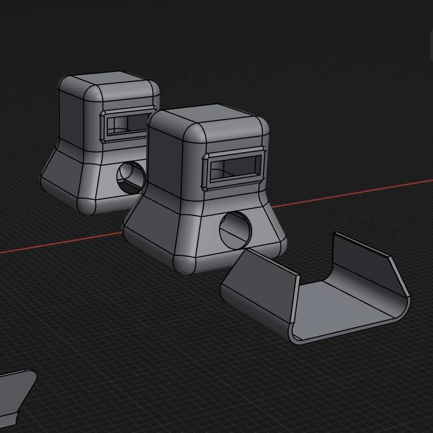
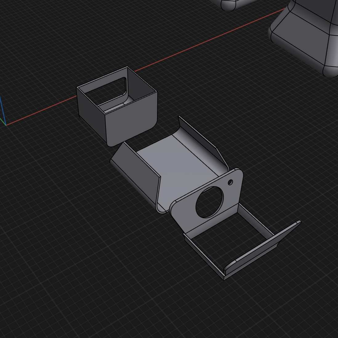
The constraints of 3D printing also influenced my design choices. If the interface were too large, I would need to divide the model into multiple components; if too small, it might not effectively engage users. I explored different options for segmenting the model while considering how the pieces would be assembled afterward.
To maintain the design's rounded corners, I decided to separate the model at natural breakpoints where the curves end, so that the pieces could be easily assembled by sliding them together. One potential solution I found was adding a wooden pole beneath the interface to provide stability and maybe even reinforce its vintage aesthetic.
Print, Prep, and Paint
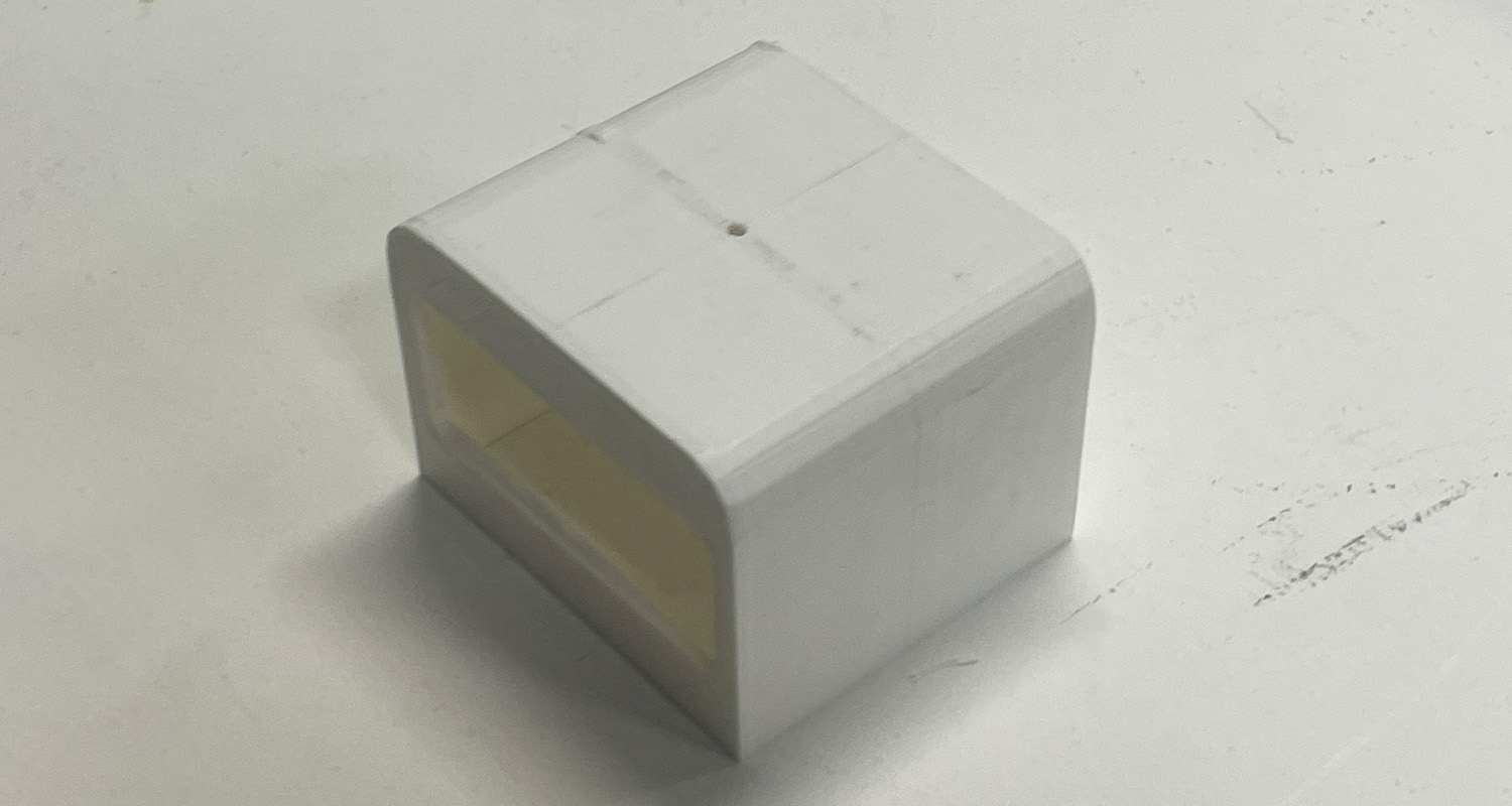
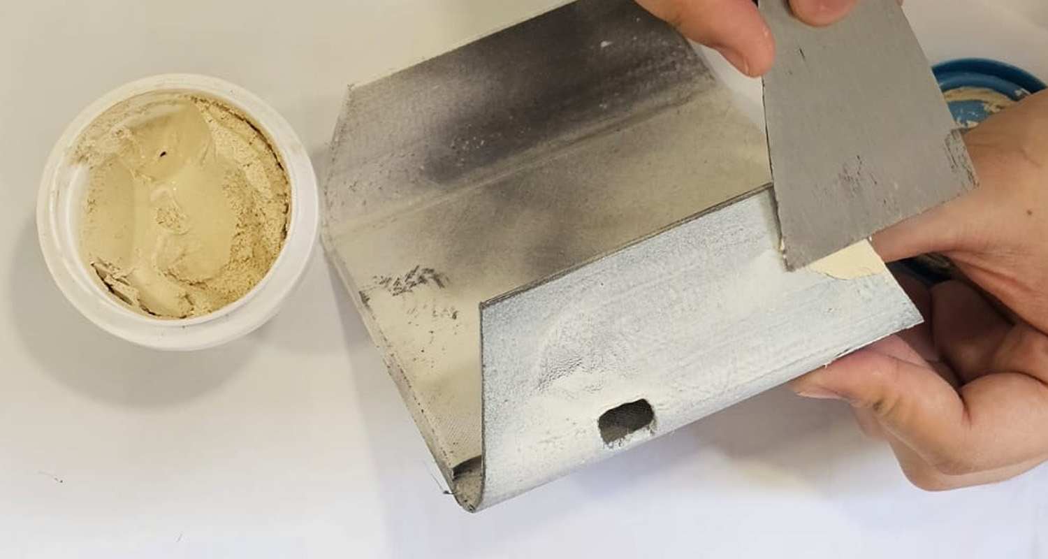
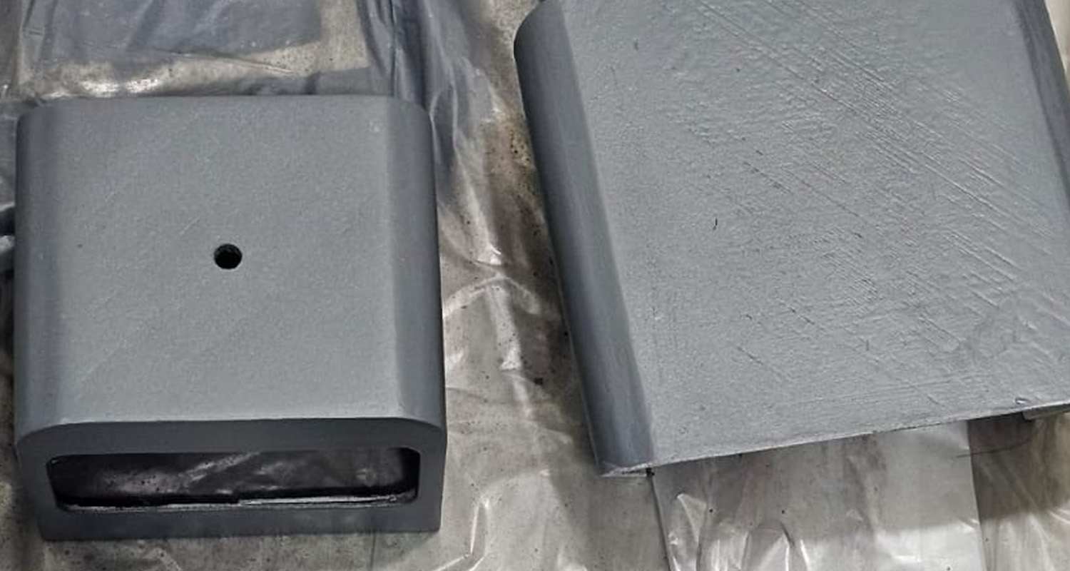
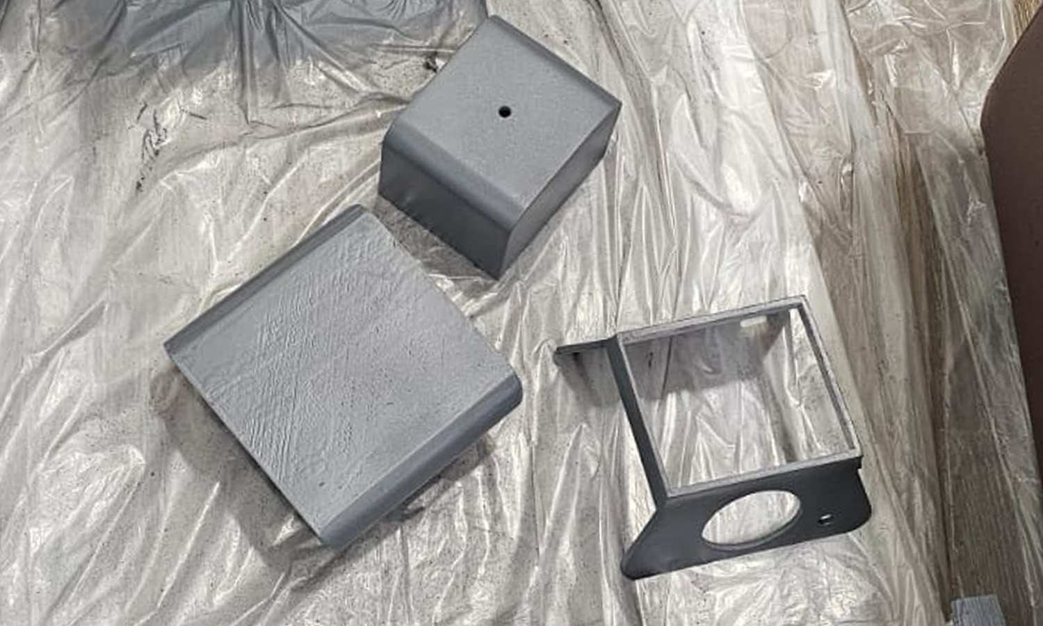
After printing each component, I used sandpaper to smooth the surface. The initial print had rough layer lines, so I started with 120-grit sandpaper, using a sponge-backed setup to reach every detail. This coarse grit prepared the surface for finer work.
Next, I filled deeper grooves and fine cracks with putty, applying it with a foam piece for control. I specifically used wood putty, which I diluted in water before applying to make it more evenly spread out. Once dry, I sanded with 400-grit sandpaper to blend the filled areas seamlessly with the surface. A sandable filler primer helped fill micro-lines and created a uniform base for painting.
Many online sources recommend using this filler primer followed by spray paint for a smooth finish. Filler primer is ideal for filling in the layer lines on 3D prints, especially when using materials like PLA or ABS. I continued with 400- and 600-grit sandpaper to achieve a smooth finish. Small files cleared out primer buildup in detailed areas, and I washed the interface to remove dust and debris.