03
Identity:
Planning the Graphics
~ 02.02.2025
Brutalism
Yet another rant! I promise this is relevant.. somewhat. I mentioned in week 0, that design should be honest. I think a good example of this can be brutalism. I’ve been researching brutalist websites recently, and I often see the term “ugliness” used to describe them. But if you have at least googled Brutalism, you’ll see that is not the intent.
-
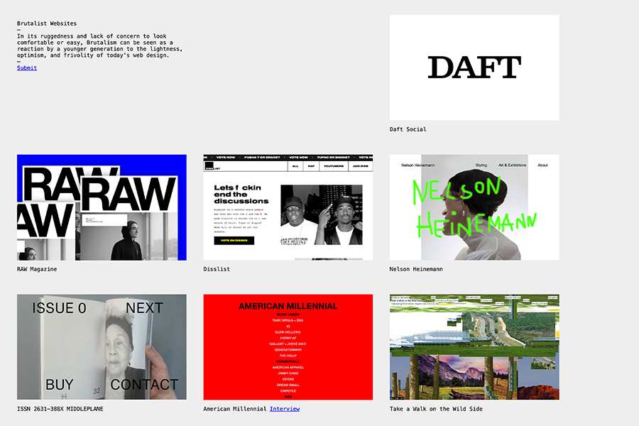
Brutalist Websites
https://brutalistwebsites.com/
-
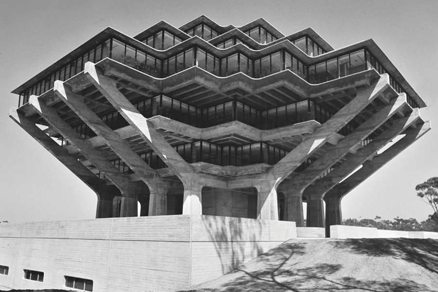
The Geisel Library
-
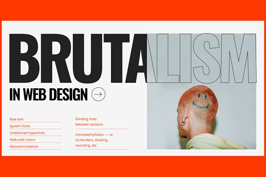
Example of a brutalist aesthetic
The original concept of Brutalism wasn’t an aesthetic per se; rather, it was an approach focused on raw functionality and honesty in materials. The roots of Brutalism trace back to mid-20th-century architecture, most famously associated with architects like Le Corbusier. The term itself is derived from Le Corbusier’s use of béton brut—“raw concrete” in French—and it emphasises the visibility of a building’s structure and materials.
In general, the movement prized functionality, straightforward construction, and the minimalist presentation of forms. Over time, though, this idea of unadorned structure carried over into modern graphic design and Brutalism has been spun into a sort of style: a visual shorthand for “edgy” or “raw”, an intentional aesthetic choice that aims to “appear” raw or stripped down.
Why I bring this up is that I’ve noticed when I talk to peers about their “brutalist” webpages, many admit they didn’t set out to embrace the style. Instead, they arrived at it through technical limitations: shaky coding skills, reliance on AI-generated scripts, or an inability to streamline bulky, repetitive code. The result? Sites that look stripped-down and raw but are structurally chaotic—overflowing with redundant divs and unoptimised assets. Even multiple unnecessary, short files because they can’t fit in all of them into ChatGPT.
To mask this, some retrofit a narrative: “The broken scroll function? It’s intentional—an unconventional function that represents my making process!” It’s not “brutalist” if the end result isn’t lightweight, efficient, or honest about its construction. While writing this and organising my thoughts, I realised that I hold a very egocentric view of design. It’s quite ironic that I criticise people who focus more on the designer than the design, yet, in a sense, I am also doing that. I hope I do not fall into the rabbit hole of pretentious self presentation that values personal branding over substance.
Roundtable Recap
In Week 2, I attended a roundtable session to discuss my practical work. Since I will start thinking about the graphic identity this week, I’ll use this entry as a chance to organise the feedback I received during that session.
I brought up a couple of concerns for feedback. First, that I’m worried that I might start approaching this project more like product design rather than what it’s meant to be. Second, that I wanted thoughts on the graphic identity of the ‘collaterals,’ like my website.
-
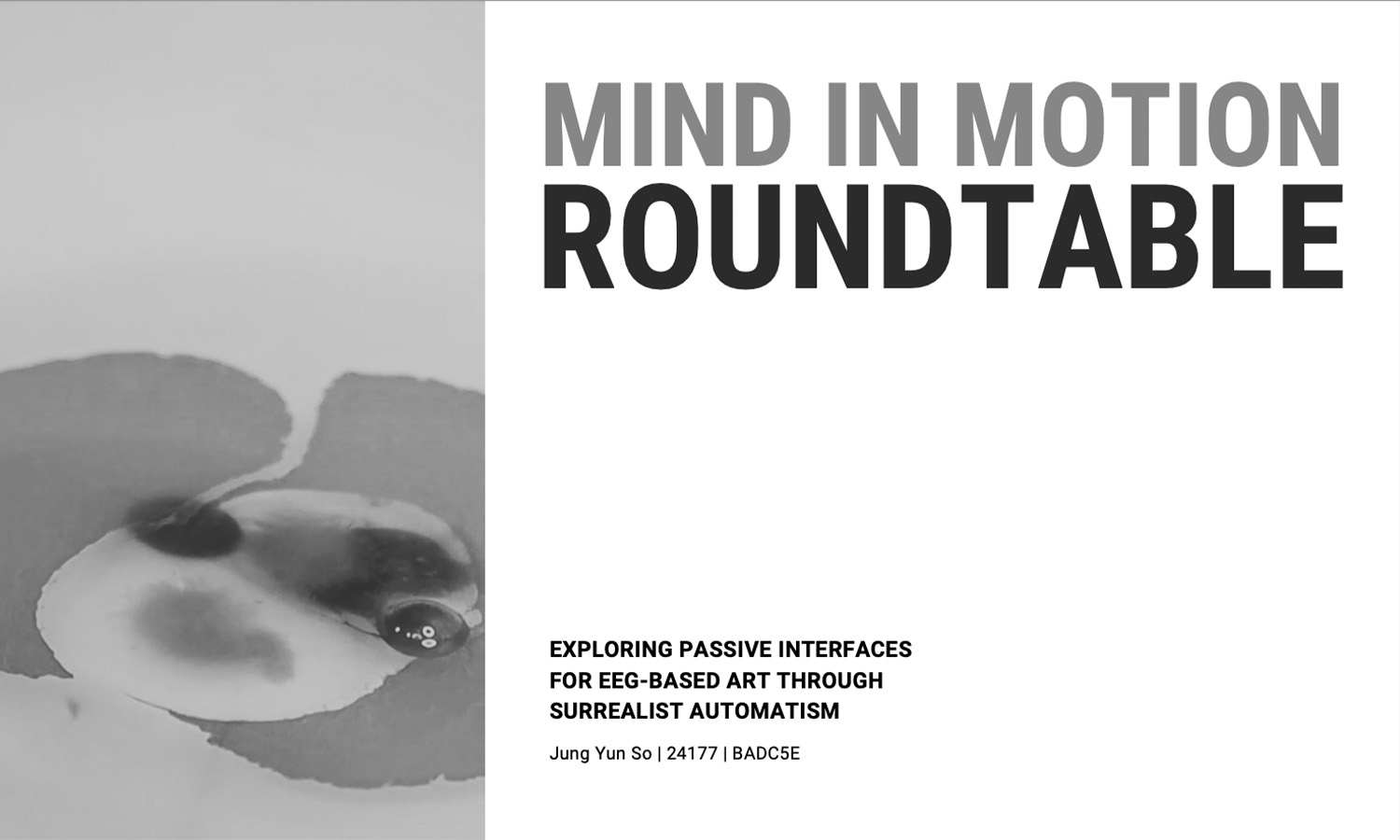
Cover slide for roundtable presentation
-
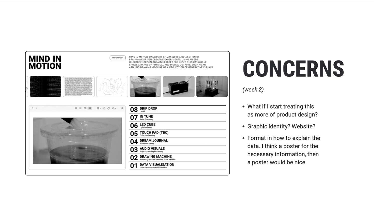
Concerns moving forward
-
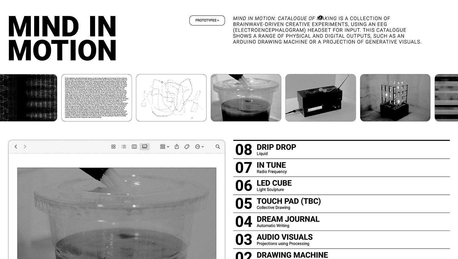
Current work-in-progress website documenting experiments
-
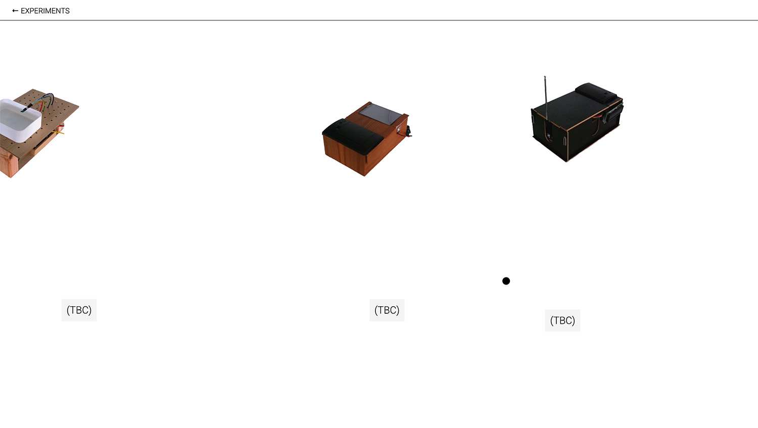
Current work-in-progress website documenting prototypes
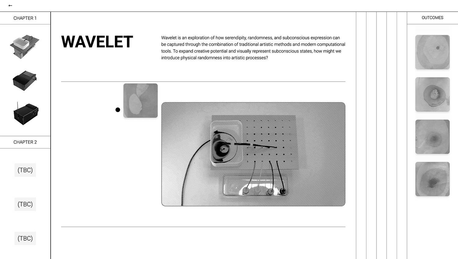
Current work-in-progress page documenting Wavelet
Vikas also commented on the layout of my website, specifically the initial experiments section. He said it felt a bit “Dieter Rams” and advised me not to lean too heavily into that look, which I found amusing since I have mentioned him a few weeks back in my prologue for week 0. While I have to admit Dieter Rams is one of my favourite designers, I understand his point. Many student projects tend to be overly modular and “clean.” However, I’m hesitant about adding artistic elements to the layout, as I’m worried they might distract users from the content. I’ll revisit this later, especially since my prototypes website, which is the main website, is already less modular.
After the roundtable, I did experiment with adding a couple of new functions to my website, but they’ve ended up feeling a bit tacky. The first is a printing effect for the outcomes, referencing the thermal-printed results, which then function as stickers across the page. The second is a sketchpad feature, inspired by the functions of my prototypes. It feels like the website is trying too hard. For now, I’ll keep them as they are, but I might make changes later depending on user feedback. It’s more important to focus on finalising the interfaces for my project. Once they’re finished, it will likely be easier to identify design cues from them to shape the graphic identity of the website.
Regarding the other presenters, I noticed some parallels between Amelia’s concerns and my own. Her project focuses on eldest daughter syndrome, and while she had a strong context, she was struggling to decide on the best approach to embody her research and insights. The most obvious approach would be designing an event, but she felt that might steer the project away from graphic design and make it feel more like event planning. Instead, she was exploring options like creating an app to build a community or designing an art book for eldest daughters.
Yasser reassured her that an event could involve a variety of graphic design work, such as designing collaterals and creating a cohesive experience that’s essentially UX/UI. I found this comment reassuring as well, especially in light of my own concerns about my project leaning too much toward product design. Shumin did note that if the 3D-printed elements look too polished, they might veer into product territory, but overall, this isn’t something I need to worry about too much at this point.
An Identity
Recently, when I start thinking about graphic identity, I often get reminded of two exercises from year 2. The first exercise was during Semester 1 in the Computation in Design class, where we did a short exercise to explore ways to visually represent a number. We were tasked with designing a visual representation of a single digit. I brainstormed several ideas for different numbers, using familiar visual schemes or representing the number through different perspectives or formats, like using a slope.
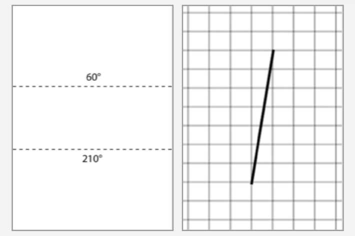
Out of all my ideas, I liked this one the most: When tasked with creatively representing the number 7, I drew a horizontal line near the top edge of the paper and added an angled line. The idea was that when you fold the paper along that horizontal line at the specified angle, the resulting shape, as seen from the side, would form the number 7. Even though it was just a simple exercise, it made me realise what type of design process I enjoy. A process that priorities having a "justification."
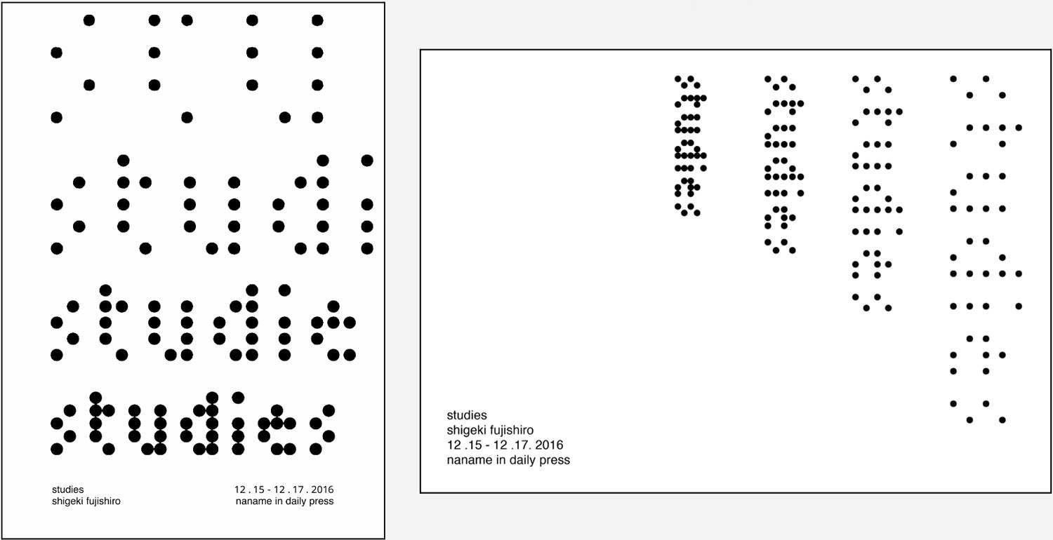
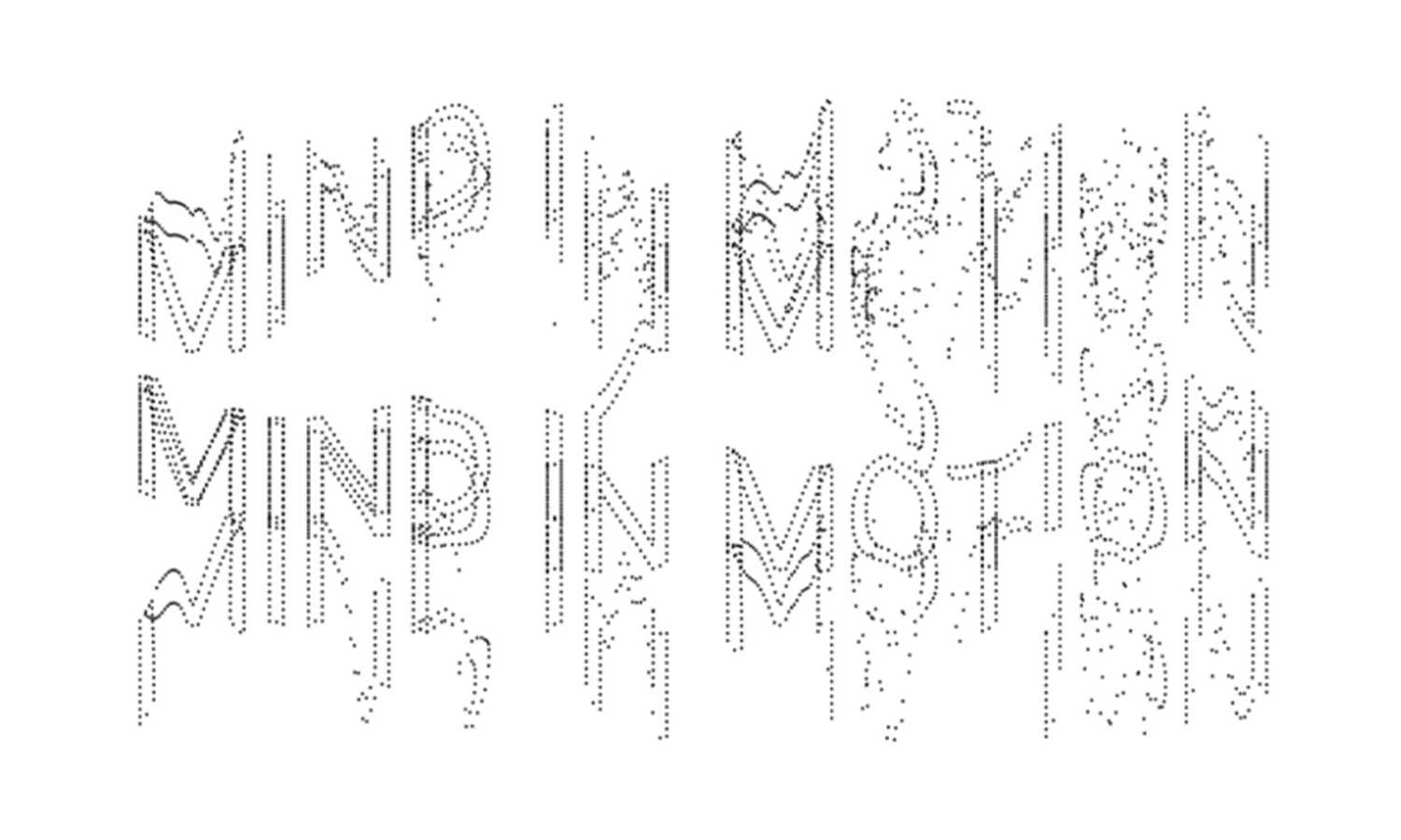
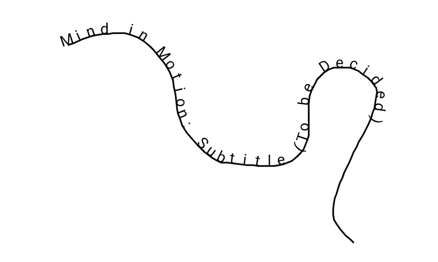
The second exercise was in Semester 2, from a workshop on choosing typeface for and creating typography poster / collaterals for the graphic identity for a semi-fictional exhibition featuring "Studies" by Shigeki Fujishir. I needed to choose a typeface that captured the essence of the project. I decided to use a typeface called "tiny." Initially, I had dismissed "tiny" as irrelevant when considered on its own, but I later realised it could work in the poster when used on the layout of the poster.
The typeface was consisted of dots that form each character typically change size depending on the weight. In my interpretation, I maintained a consistent dot size while modifying the overall typeface size. This approach creates a visual concept where the objects are uniform in size yet appear differently based on perspective—suggesting a uniformity within a group that shifts in legibility depending on the distance. My outcome for this one was obscure and difficult to persuade the viewer of.
For my current design, I want to start developing my own spectrum of traits to position my sketches and, based on that, make better choices for graphic elements. For example, I believe that if something is too obvious, it becomes tacky; if it is too obscure, it becomes unconvincing. This will be the first axis of my spectrum.
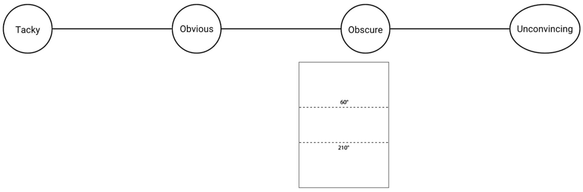
A good example of obscurity is my outcome from the Semester 2 design exercise. Conversely, a good example of tackiness would be if someone claimed that a blank sheet of paper represented the number zero. A thought that (I admit this with some shame) briefly crossed my mind. An example of something both tacky and obscure, is something I don't even want to bring up, since I hope whoever created that piece doesn't end up reading this somehow.
While watching a movie, I half-mindedly sketched out some ideas. I also used p5.js to visualise some of them. There isn’t one that really sticks out to me, but there are a few that I think have potential. First, let’s map them out on the trait spectrum map that I made.
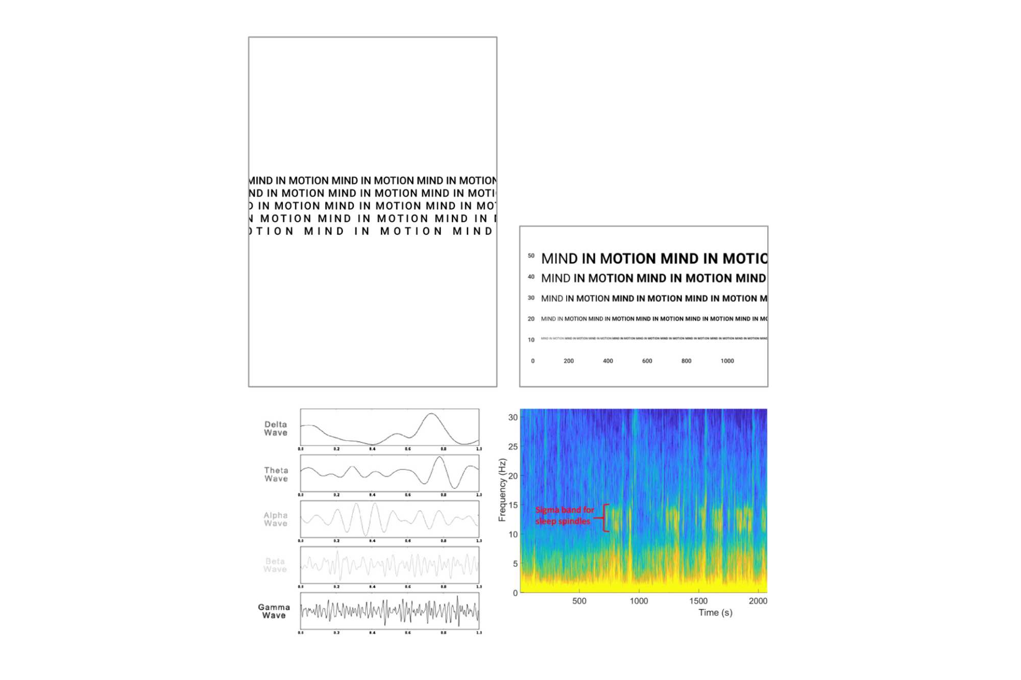
(A) Brainwave Frequencies: This poster uses typography to represent the five brainwave frequencies of EEG data through repetition and spacing of the title text. The title is repeated five times, each line corresponding to a specific brainwave frequency: Delta, Theta, Alpha, Beta, and Gamma. The first line has normal letter spacing, reflecting the slowest frequency, with each subsequent line increasing in spacing, culminating in the widest tracking for the fastest frequency.
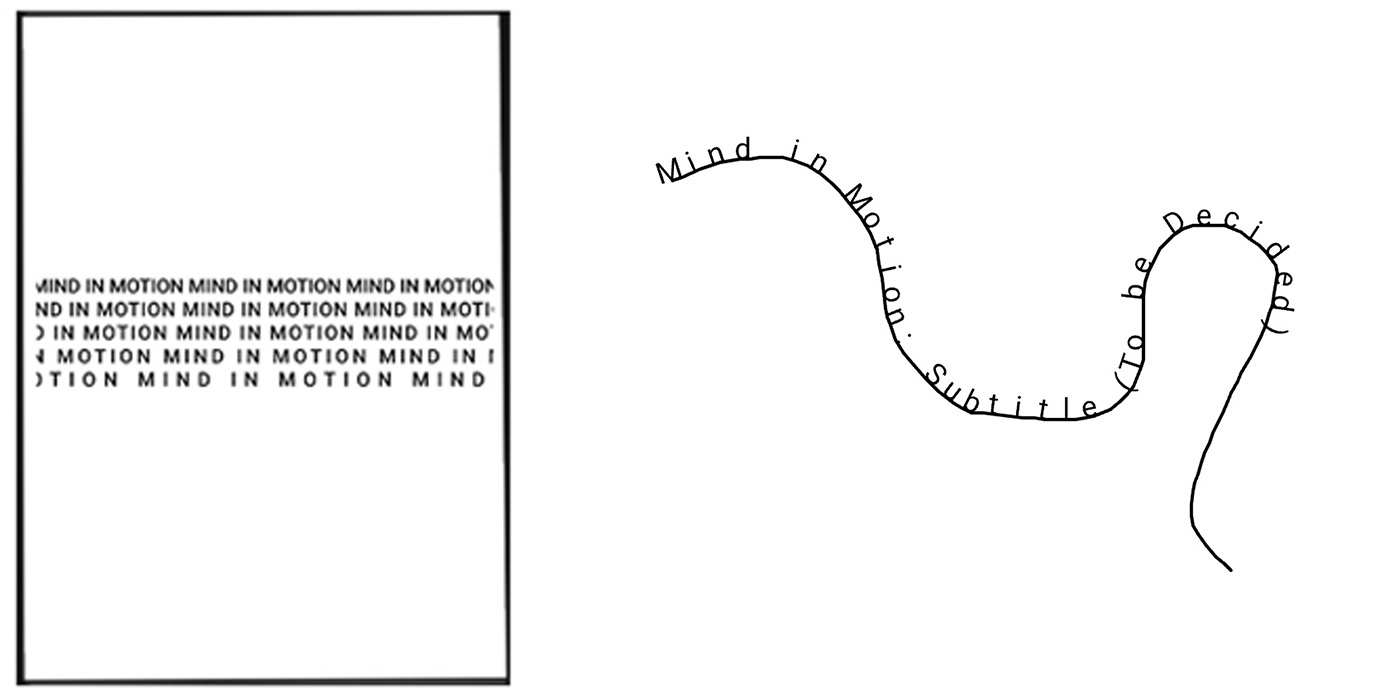
(B) EEG based Spectrogram: This concept translates an EEG spectrogram into a typographic poster. Typically, a spectrogram displays frequency on the vertical axis and time on the horizontal axis. Here, the vertical axis spans frequencies from 0 to 60 Hz in intervals of 10 (0, 10, 20, 30, 40, 50, 60), with the frequency value determining the font size. The horizontal axis measures time in intervals of 200 seconds, from 0 to 1000 seconds (0, 200, 400, 600, 1000), with the progression represented through font weight.
- (C) Uses audio frequency to “draw” the text.
- (D) Five different wavelengths as the base for particles in generative typography.
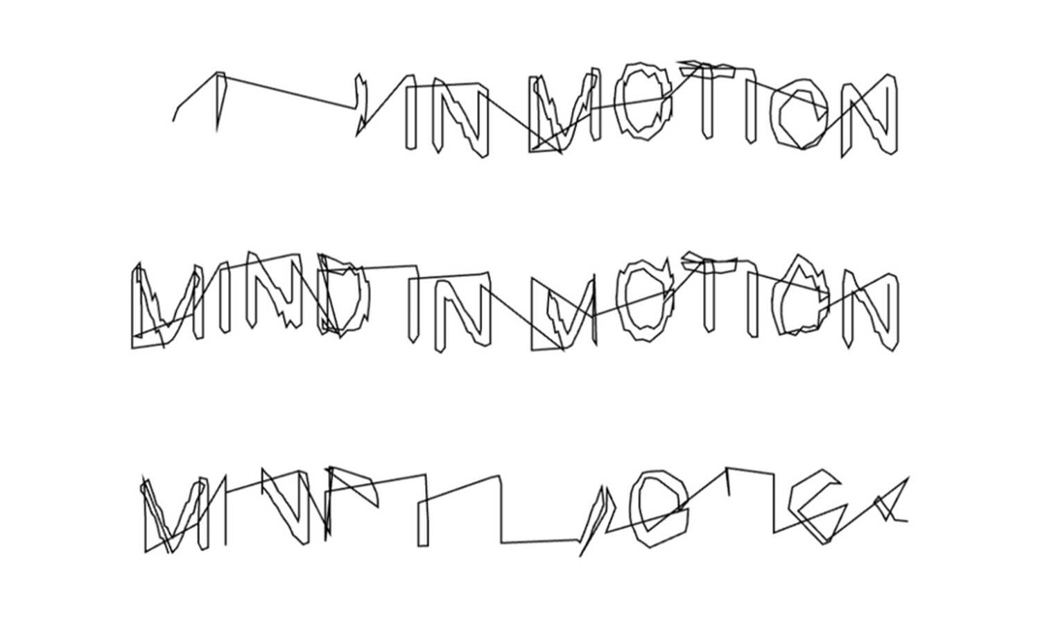
- (E) The mouse is used to draw lines, with the title text appearing over the line. The text is only revealed through the act of drawing, like the concept of automatic drawing.
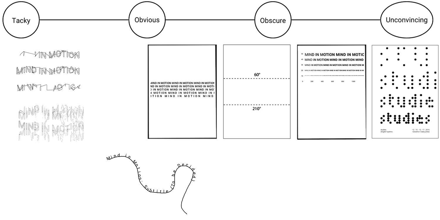
Poster B sits somewhere between obscure and unconvincing on the spectrum. While the concept is intriguing and there is a certain appeal in the coincidental alignment between the visuals and the underlying idea, it ultimately requires too much context to be understood. Even with context, the design risks confusion, reminiscent of my Year 2 typography poster using Tiny, which suffered from a similar lack of clarity. In contrast, the poster B falls somewhere between obvious and obscure. There is a potential for wit in the design, particularly when the context is clear, but it also risks feeling somewhat tacky. The direct translation of frequency to tracking can appear overly literal, bordering on cheesy.
When considering the p5.js sketches, the first sketch feels quite tacky and suffers from poor user experience. The second sketch also leans toward the tacky end of the spectrum, with low readability making it unconvincing. However, the third sketch strikes a better balance. It sits more comfortably in the 'obvious' range without veering into tackiness, offering a clearer and more engaging interaction.
At this stage, poster A and sketch E are my top choices. Moving forward, I plan to explore the use of variable fonts to make the typography interactive on websites, aiming to refine and develop these concepts further in the coming weeks.