14
Deliverables:
Finalising Video and Booklet
~ 18.04.2025
Website
For my publication, I've maintained a consistent aesthetic since first semester—featuring collapsible/expandable indexes and containers that resemble book pages or shelves, reflecting my overall design approach. This week was for adding content additions while preserving this established visual language.
After seeing other projects during open studios, I briefly considered changing my title typeface. However, following feedback from peers and lecturers, I recognised that my existing visual language was already sufficiently distinctive: the modular layout, image filters on my website, black and white aesthetic, and vintage aesthetic elements, though subtle, created a cohesive identity.
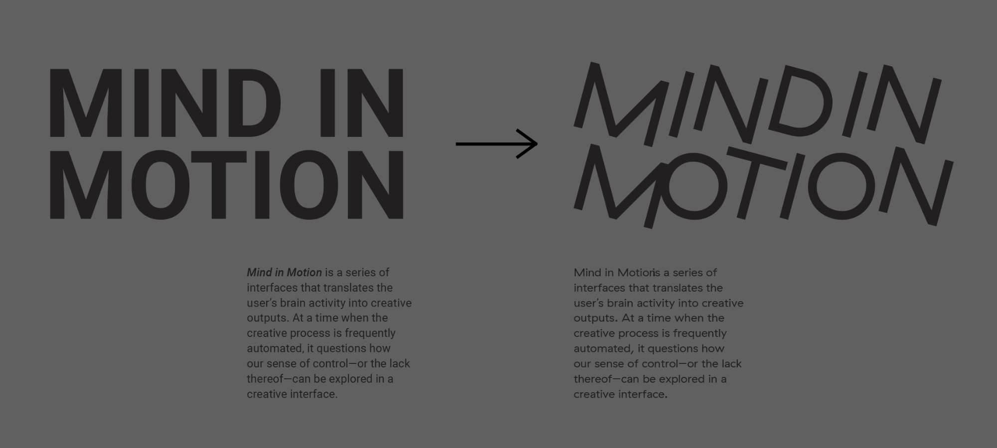
While the alternative typeface I considered was attractive and suited my title, changing it wasn't worth the risk. It didn't perfectly harmonise with my existing body text typeface, and the kerning felt quite awkward in some parts. Also, implementing it would require changing all body text, reconsidering layouts, and essentially redesigning everything—a time-consuming process that I deemed unnecessary. Several viewers, including a lecturer, also mentioned that as simple as it is, my current title typeface complements the project, so I decided to keep it. I remain satisfied with the Roboto typeface I'm currently using.
I also developed my catalog of making website by adding several P5.js sketches to better explain my interface mapping. I typically demonstrate mapping for interactive projects through two approaches. The first displays input and output side by side so readers can see the contrast—either through a slider allowing users to compare before/after states, or through side-by-side videos.
The second approach is to add interactive elements enabling readers to adjust values and observe resulting changes in the outcome. While more challenging to implement, this second method is more effective according to both my assessment and peer feedback. Consequently, I created P5.js sketches for each of my three final prototypes to implement this interactive approach.
This P5.js sketch is for the wavelet interface, to demonstrate how the EEG data is mapped to different colours. On the left, four colored bars display real-time brainwave intensities: blue for delta (deep sleep), green for theta (drowsiness), yellow for alpha (relaxation), and red for beta (concentration). This is to show how when a brainwave band exceeds its threshold, it triggers the colours. The right panel displays the resulting marble painting effect.
Each triggered brainwave creates a concentric circle in its corresponding color, with the first drop producing the largest circle and subsequent drops creating progressively smaller circles inside it. All circles share the same center point, creating a layered effect similar to marble painting. The visualisation allows up to 7 total circles before completion. It also includes a restart button to begin a new painting and a save option to download the final artwork.
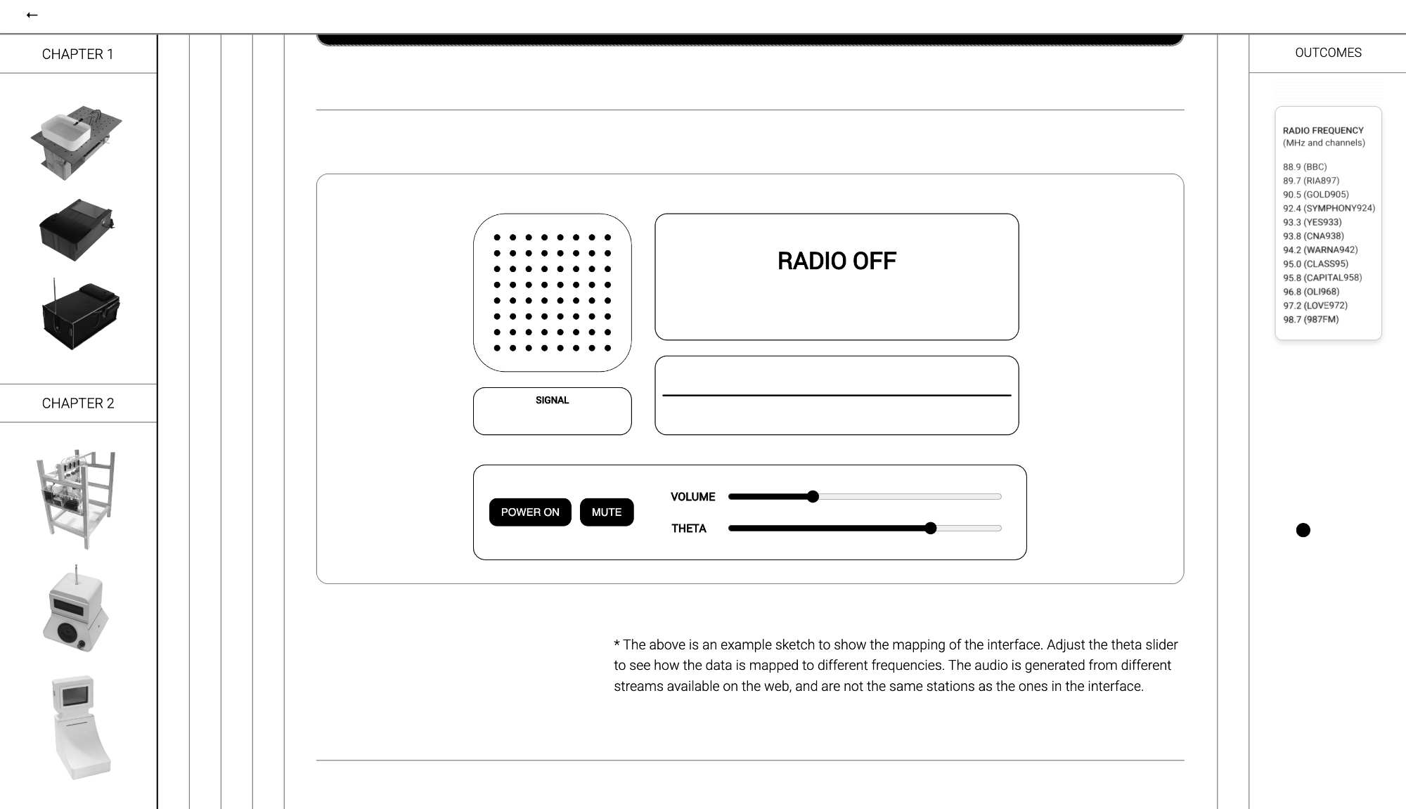
The frequent encounters sketch shows how the mapping works. Because FM signals cannot be received via p5.js, I used live internet streams to replace the real radio channels of Singapore. On the left, signal strength appears as amplitude along the y-axis.
The Automata sketch is the most straightforward. The sketch on the website shows almost exactly what the user will be looking at on the OLED screen. The only difference is the slider acts as the input rather than the headband.
Introduction Video
Before open studio, I planned to create an introduction video explaining my project's concept, background context, process, and outcomes. The background context and process sections could be very brief—perhaps a sentence or two—while the outcomes would be explained more thoroughly, especially given their quantity.
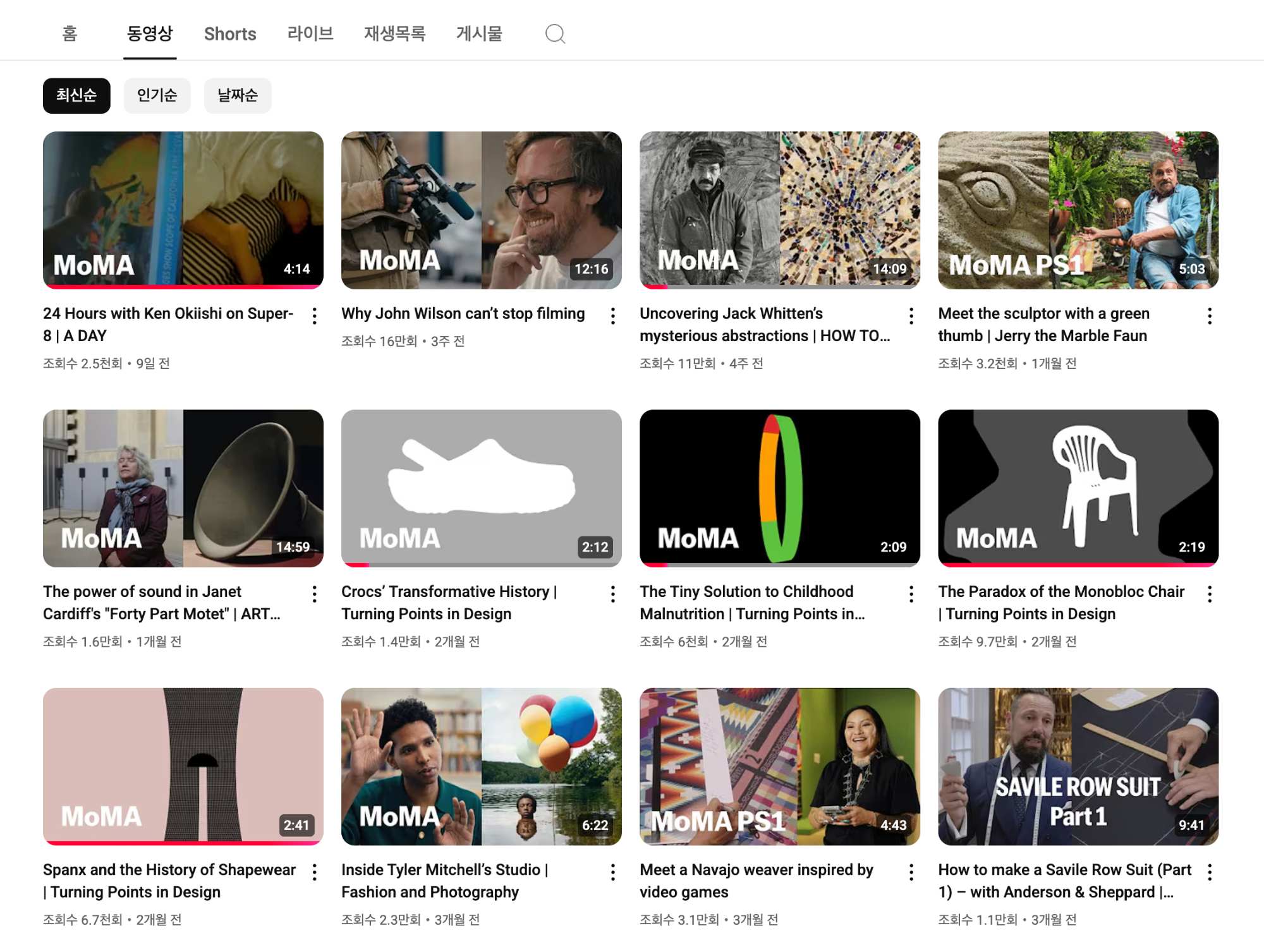
As mentioned earlier, I turned to one of my favorite reference YouTube channels—although it's far from a niche choice—the MoMA channel. My previous documentation has a similar aesthetic of simple, clean editing with ambient background sounds. I hadn't previously attempted voiceovers because I lacked confidence in my pronunciation and more importantly, proper recording equipment. To subvert mystification of the project as mentioned in my reflection above, my main focus was clarity and accessibility.
However, after seeing others' videos during open studios, I decided to try it. I noticed that the recording quality wasn't particularly noticeable—whether someone used professional equipment or just an iPhone—so I decided to experiment with voiceover. It was much more helpful for the user to focus on the visuals. Rather than selecting a specific video for inspiration and following one particular format, I watched sevral different MoMA videos and developed my own aesthetic/editing approach.
One of the biggest takeaways from the reference videos was how they use different framing for different footages. I realised that this framing could be used as a way of showing "older" footage, or "background context."
This was also a practical choice, as most of the footages I found that were copyright-free were of diverse quality, and the framing felt more like a cheat code that added some level of consistency.
I preferred not to use stock footage, but lacking video material for the introduction, I included two clips from Pexels. Although I didn't consider filming this particular section as worth the time investment, now I'm somewhat dissatisfied with this decision.
Since these are the two clips that appear at the very beginning of the video, they might create a less favourable initial impression for viewers, but I've accepted this compromise for now.
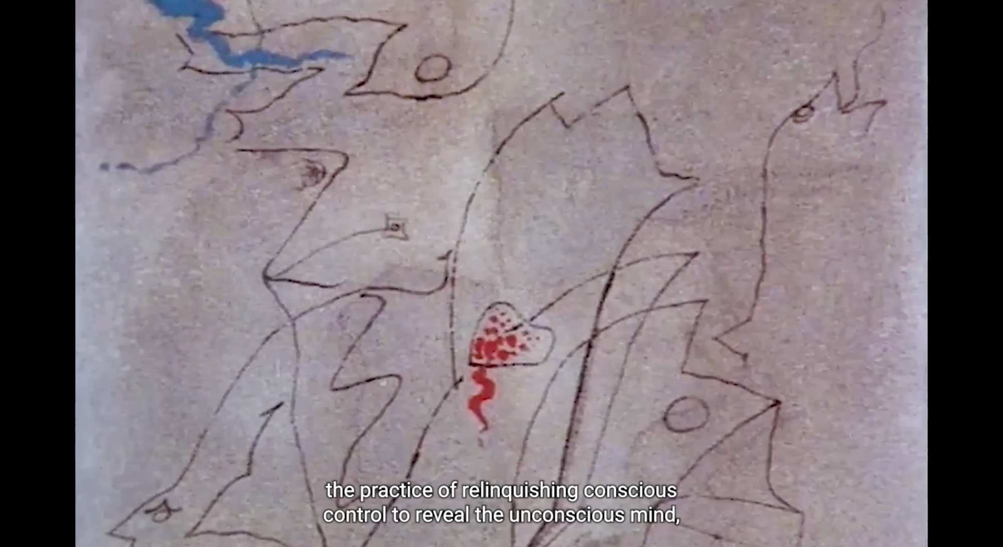
Despite having much to say and gaining access to several copyright-free footage that could enhance my explanation of surrealist automatism, I consideredthe perspective of first-time viewers. This remains a valuable resource that could potentially enhance context in a future video essay after my project submission. The abover is an example of a footage I found, which is an explanation of Exquisite Corpse with a voiceover of an excerpt from the First Manifest of Surrealism. I can imagine this can be a convenient way to demonstrate the historical context in less time, but may feel a bit jarring, especially as a standalone amongst my recordings.