15
Viva Voce:
Setup and Preparations
~ 25.04.2025
Documentation and Presentation
I will start this week with a brief reflection following reference research for my catalogue of making and the documentation video. When it comes to documentation, as I have mentioned last week, a lot of my inspirations come from MoMA.
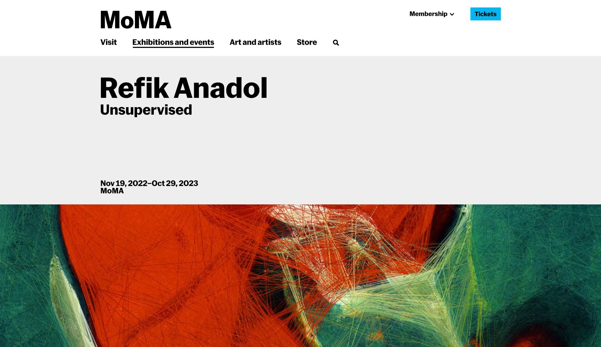
Recently, I've read several articles about Refik Anadol's Unsupervised — Machine Hallucinations (2022) at MoMA. While I admire how MoMA's iconic presentation elevates the piece, I'm left with mixed feelings—particularly about how AI art is framed as a spectacle of inscrutable computation. Anadol's work, a GAN trained on MoMA's archive, renders a hypnotic "latent space walk" between 180,000 artworks, augmented by abstract data visualizations (motion-triggered lines, weather inputs, visitor movements). The result is undeniably beautiful, under an ambient soundscape that evokes a kind of digital cathedral. Yet, for all its grandeur, the piece leans heavily into mystification—presenting AI as an oracle rather than a tool, something to be awed by rather than understood.
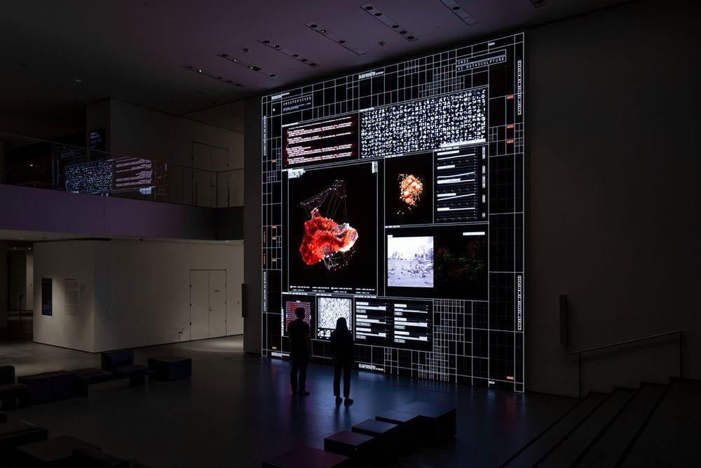
This tension resonates with my own project, even though in a very broad context and a much smaller scale. Like Anadol, I'm working with machine-mediated creativity, but where he embraces opacity, I want to prioritise transparency. His interface screen, cluttered with cryptic code snippets, feels designed to overwhelm.
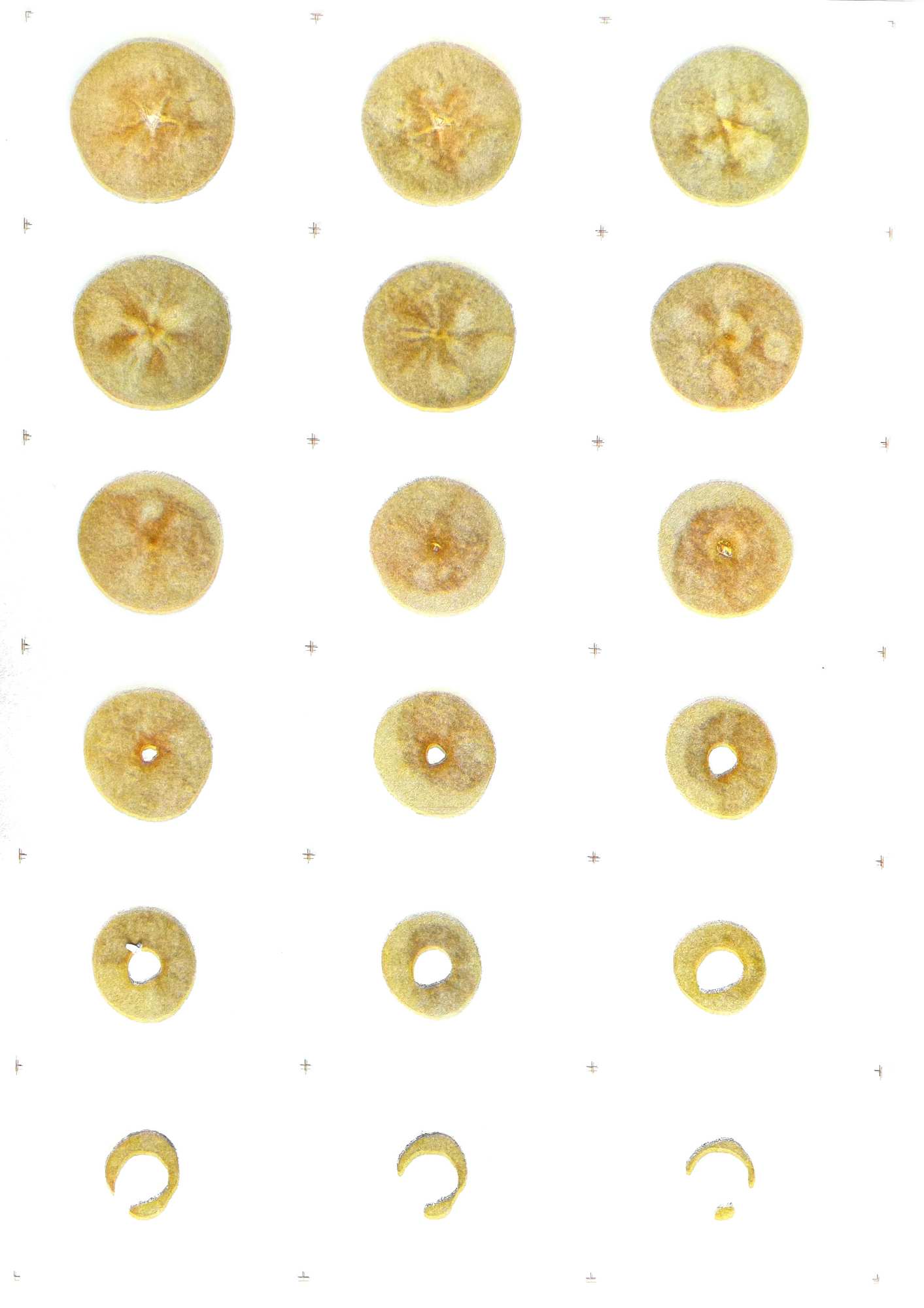
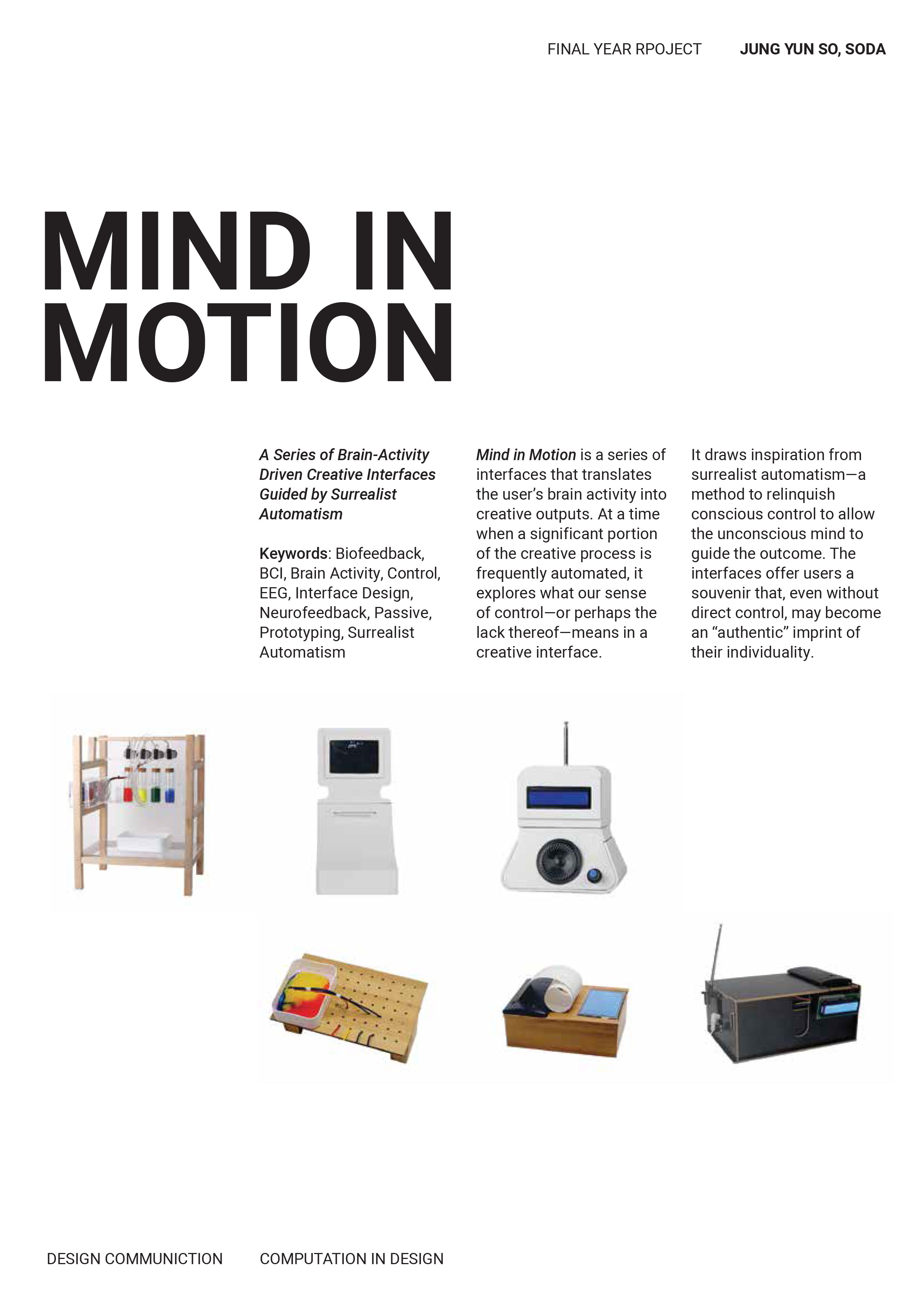
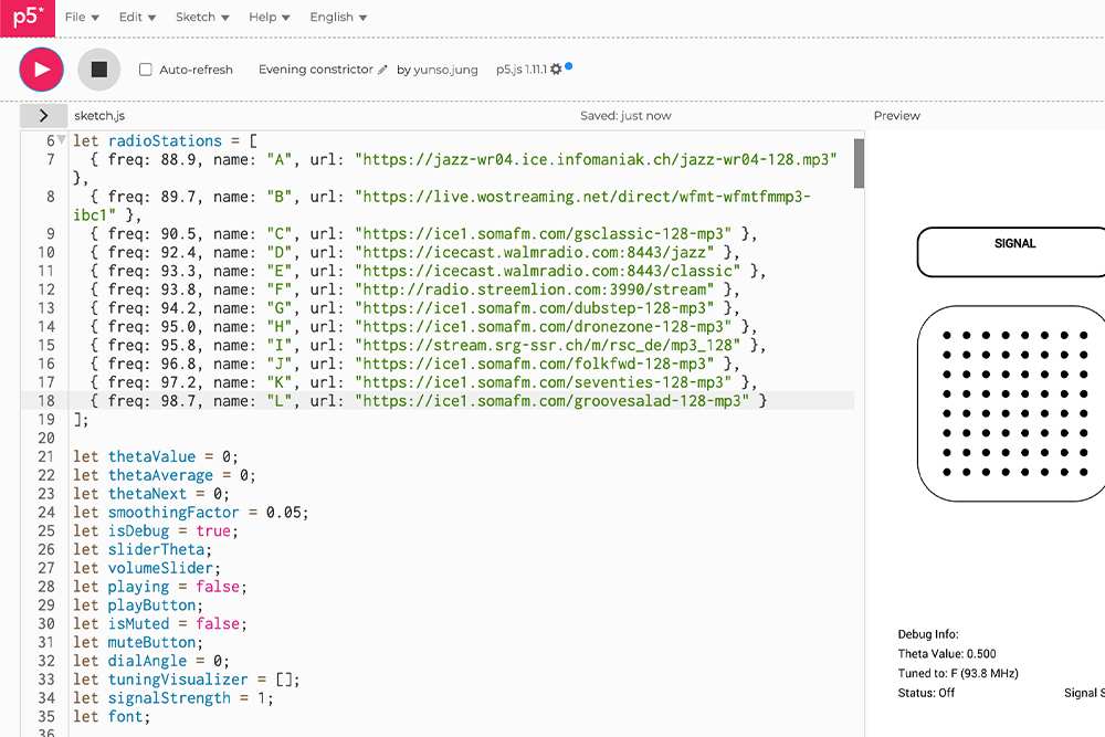
As an attempt to subvert this, I had created P5.js sketches which explicitly map input-to-output relationships—showing how EEG data becomes color or radio signals or visual patterns. I don't want users to feel passive before an unknowable system; I want them to engage with its mechanics, even if that means exposing its seams.
Unsupervised also makes me wonder about context. His GAN treats MoMA's archive as a closed system, separating artworks from their histories—who made them, how they were acquired, what they signify. This divergence feels important for my own work: In the future, how can I ensure my project doesn't just attempt to critique automation by demonstrating it, but actually makes it compelling for the majority?
At the moment, Anadol's installation leaves me wary of the "MoMA aesthetic"—spiritually vague. While I appreciate its sensory impact, I'm more drawn to art that demystifies its own systems. As I finalize my project, I'm asking: Can my documentation avoid romanticising tech? Does my interface empower users to tinker, or does it render them spectators? Instead of just grandeur, I aim for clarity—inviting curiosity, not reverence.
Viva Voce Setup
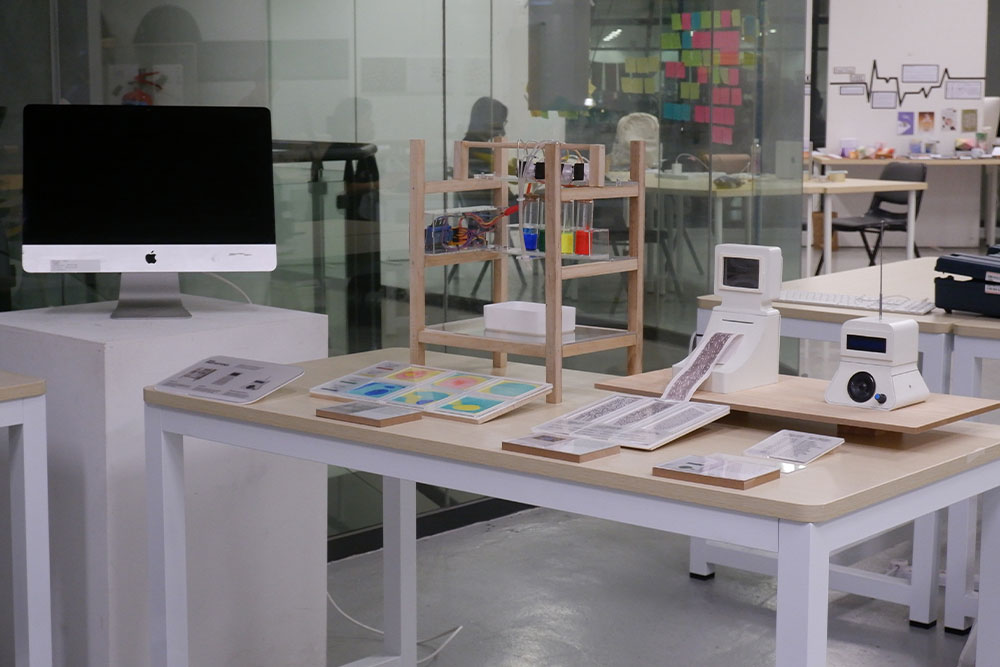
Originally, I planned to use a central classroom space with an L-shaped arrangement of two tables and one partition. However, this felt too cramped, and the partition couldn't be moved due to wiring limitations. Instead, I chose a corner setup with two partitions forming a large wall, offering better flexibility for my tables and plinth placement.
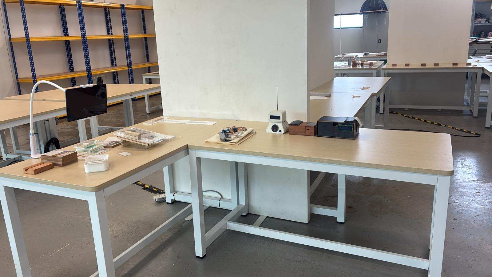
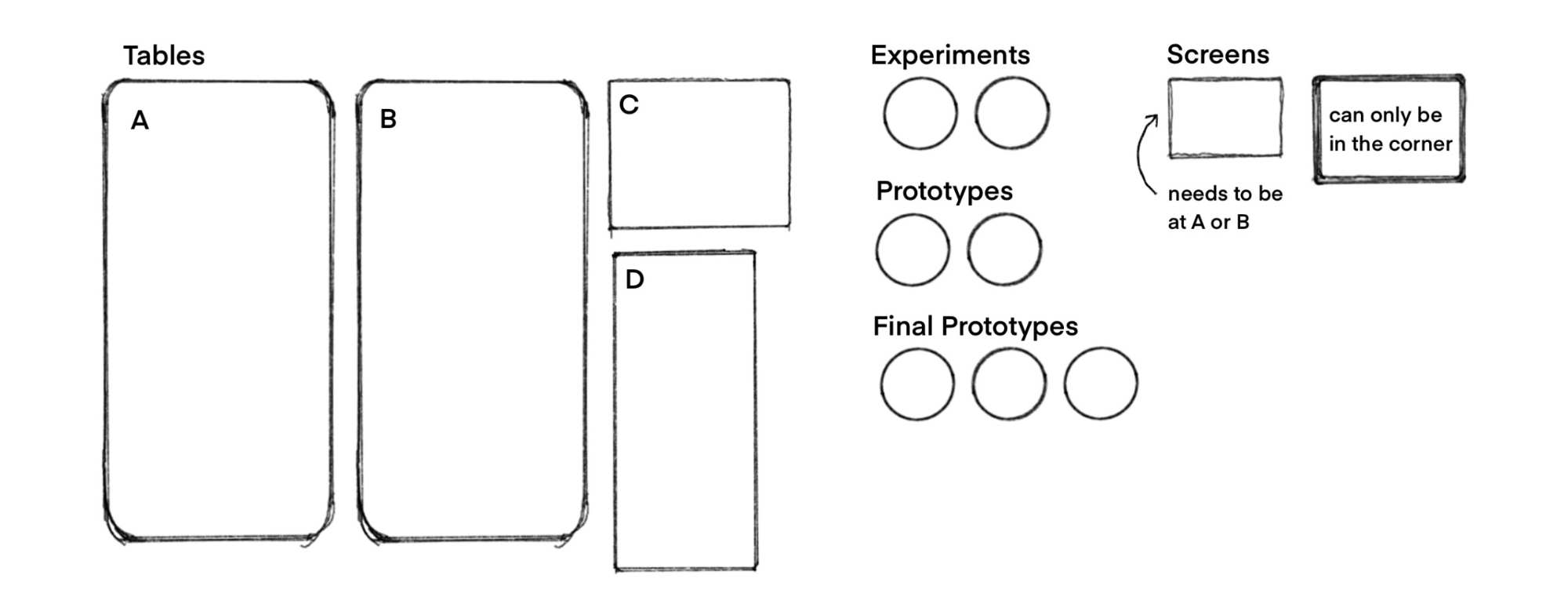
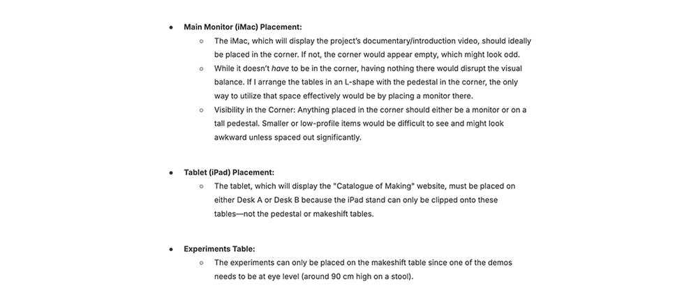
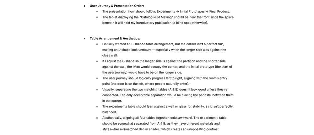
The iMac, which will play my project's documentary video, ideally belongs in the corner – without it, the space would look oddly empty. While not strictly necessary, corner placement creates better visual balance. Since sightlines in the corner are challenging, anything placed there needs sufficient height to be visible; either a monitor on the table or an item on a tall plinth would work. Smaller objects would get visually lost unless given excessive spacing, which isn't practical.
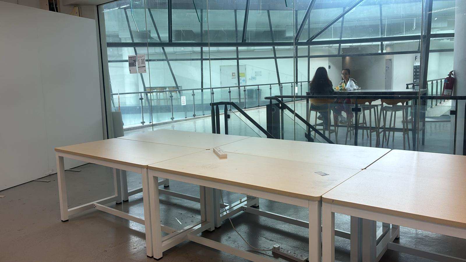
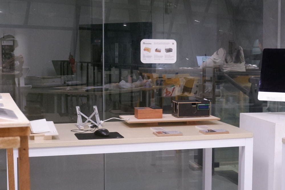
For the tablet displaying my "Catalogue of Making" website, placement is constrained by the iPad stand's requirements – it must clip onto either Desk A or B, as the plinth and makeshift tables won't accommodate it. The experiments table presents its own requirements: one demonstration needs to be elevated to eye level (about 90cm on a stool), so it must use the makeshift table that can support this height.
The presentation sequence follows a deliberate user journey: beginning with experiments, moving to initial prototypes, and concluding with the final product. This flow informs the physical layout, with the tablet (showing both the catalogue and introductory booklet beneath it) positioned prominently near the front. The corner iMac then serves as the culminating experience, displaying the documentary at a 45-degree angle to envelop viewers.
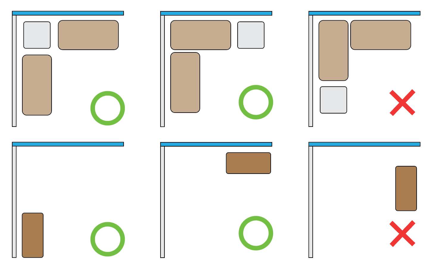
Aesthetic considerations further complicate the arrangement. The two primary tables (A and B) share matching designs and look best when connected or minimally separated – the only graceful division being a plinth placed between them at the corner. The experiments table presents a visual challenge; its different material and style clash when placed too close to the main tables, like mismatched denim. It needs some separation, ideally stabilised against a wall or glass panel due to its slight instability. While aligning all four tables might seem logical, the result looks awkward, so careful spacing is essential.
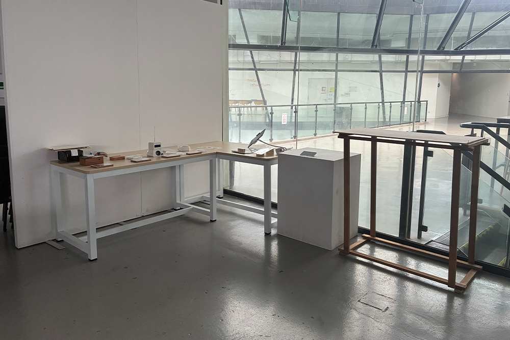
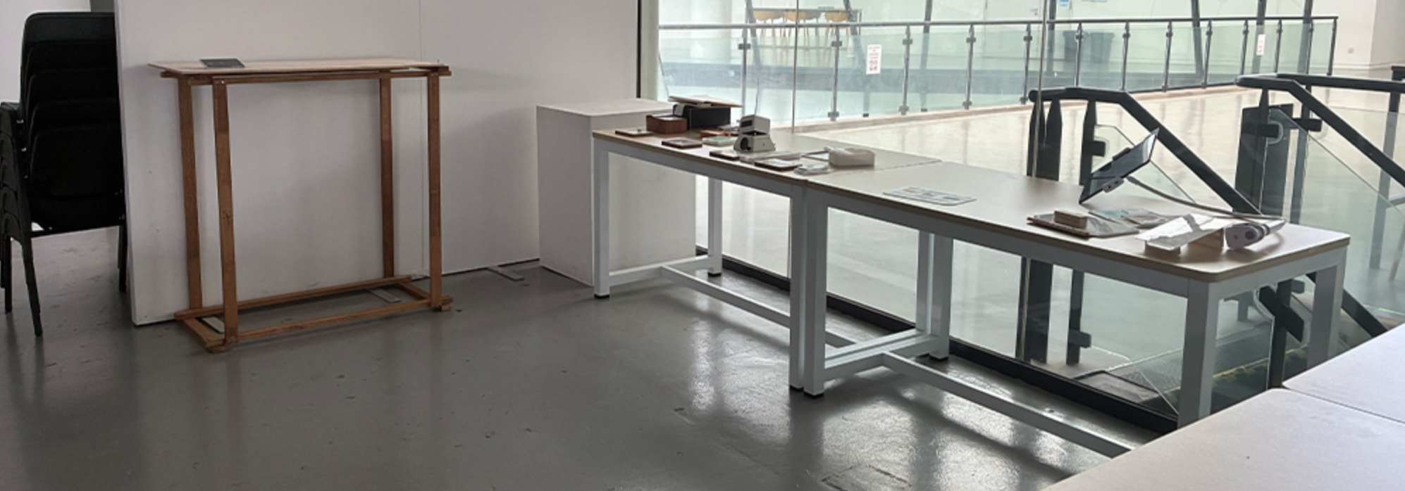
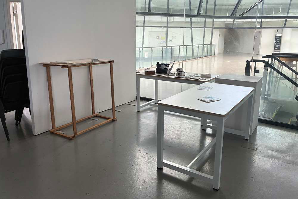
After testing multiple configurations, the most successful layout minimises spatial drawbacks while creating an intuitive visitor flow. The experiments take centre stage for immediate engagement, followed by the tablet with introductory materials, culminating in the corner iMac's documentary. This arrangement maintains visual harmony, accommodates all technical requirements, and guides visitors naturally through the presentation narrative.
Overview Document & Slides
For my overview document and slides, I followed the same style I have for my other documents / collaterals: a simple and straightforward modular layout.
It is similar to my entire project documentation, especially considering that I used a similar layout to create descriptions for my open studio setup and final setup.
Personal Note
This is a short, personal note for me to reflect on later down the line, and not to be clarified for others. My perspective on design has changed over the three years at Lasalle. This has followed something like the Dunning-Kruger effect—not in the typical sense of confidence in learning, but my confidence in the choice of career path and respect for the field of design.
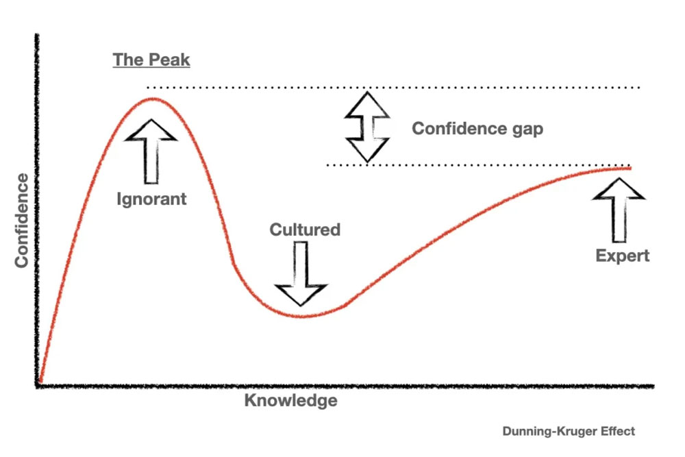
When I first began studying design at Lasalle, every designer I encountered seemed like a remarkable creative force. But the more I learned and saw, the more my respect for the discipline waned—for many reasons I will not state here, but some I've noted elsewhere in this semester's CPJ. However, as I progressed through Year 3, I began to see that there's a place for everyone in this field. I don't need to force myself into moulds that don't fit.
I've come to accept that I'm an honest designer. Design is vast enough (or vague / loose enough considering its short history) to accommodate those who create just as much as those who proclaim. For now, that's enough. I hope when I revisit this note in the future, I can answer some of the questions left unanswered throughout this CPJ, and that I have found that sweet spot between obscurity and clarity.