11
Setup:
Collaterals and Curation
~ 28.03.2025
Publication
Last week and earlier this week, I was more focused on the Open Studios branding. This week's entry will focus on preparations for my own setup. Starting with the publication, which will replace the series of posters I initially planned.
Originally, I had planned to rely primarily on posters for my project collateral, assuming visitors might not engage with more detailed publications. However, after conducting my own walkthrough of peers' setups during Open Studios preparations, I noticed a pattern in my behavior—I rarely stopped to read posters or lengthy descriptions, and neither did my friends.
Instead, we found ourselves consistently drawn to videos or structured publications. This observation led me to recognise the importance of temporal elements in presentation formats; both videos and publications naturally guide viewers through information in a sequenced manner, making complex concepts more digestible.
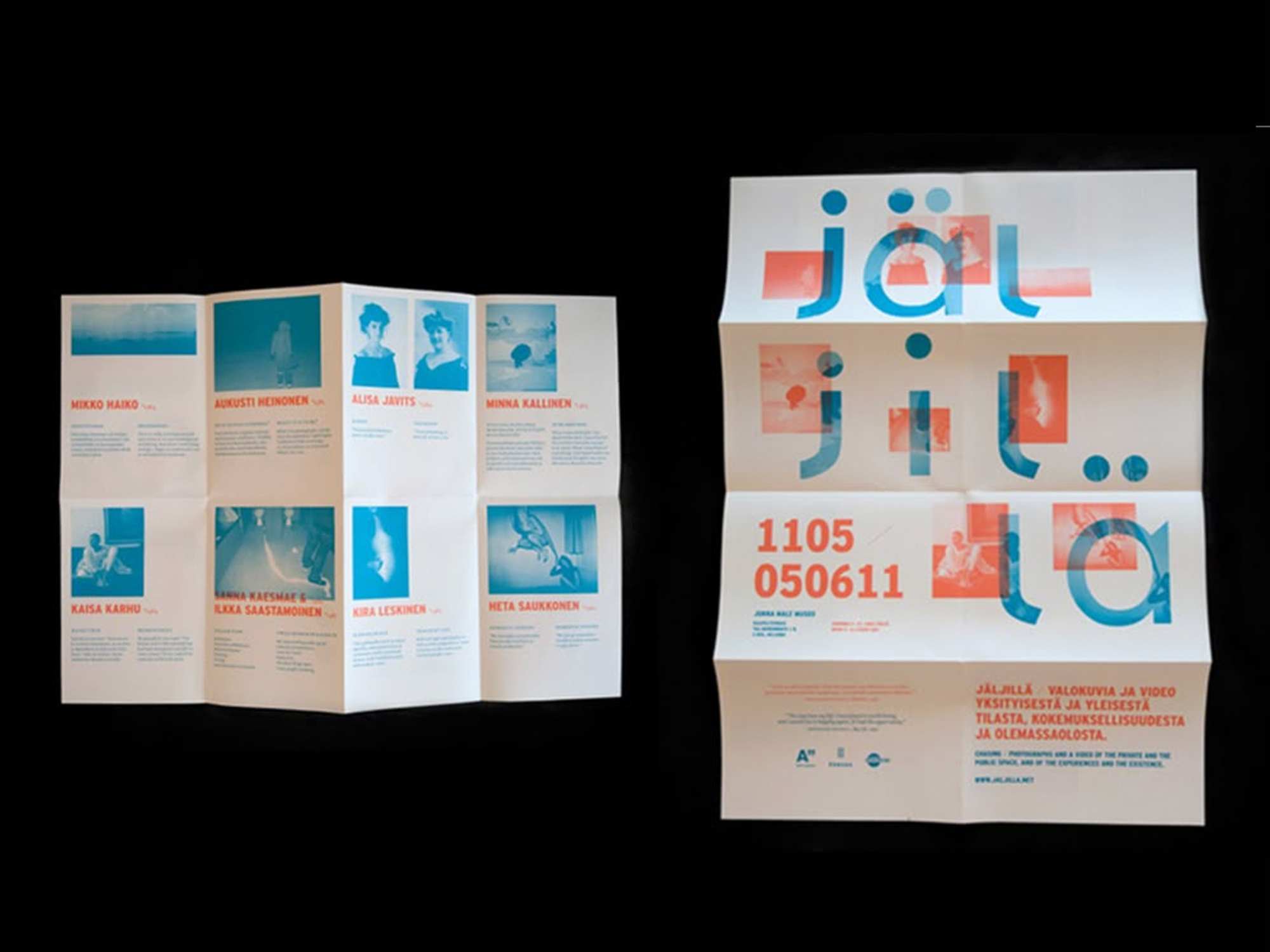
For my publication, I settled on creating an introductory pamphlet after considering several alternatives. One initial idea involved designing a fold-out pad that could transform into a poster, with an interior featuring a bird's-eye view of my exhibition setup—similar to an amusement park map. However, this approach felt unnecessarily elaborate for the scale of my installation.
I also contemplated adding numbered markers to direct participants through a specific viewing sequence, but given the spacious layout of my setup, this might be a bit redundant. The numbers would have needed to be excessively large to be visible from a distance, potentially disrupting the visual cohesion of the overall setup.
Ultimately, I opted for a modest booklet that comprehensively explains both the overarching project and individual interfaces. While I acknowledge there's no guarantee visitors will read it thoroughly, I prioritised this format over posters and excessive wall text. The booklet's design was meant to be straightforward and clear with simple layouts, though I plan to refine it further after Open Studios.
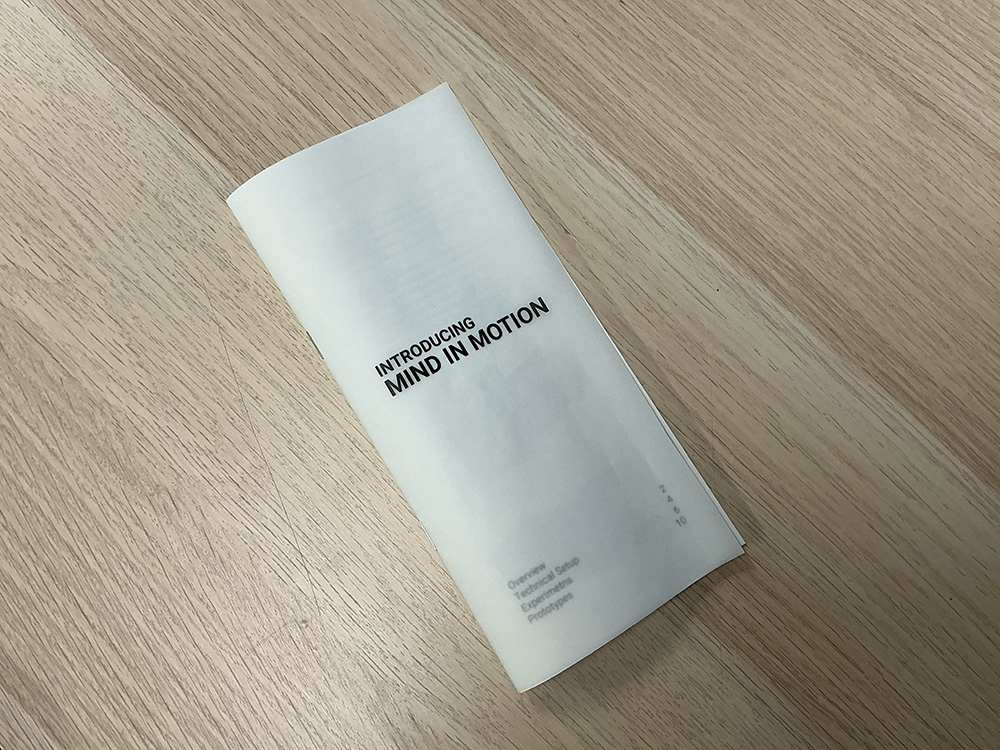
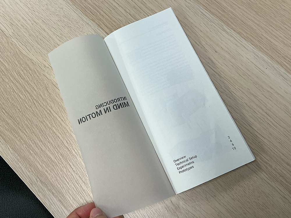
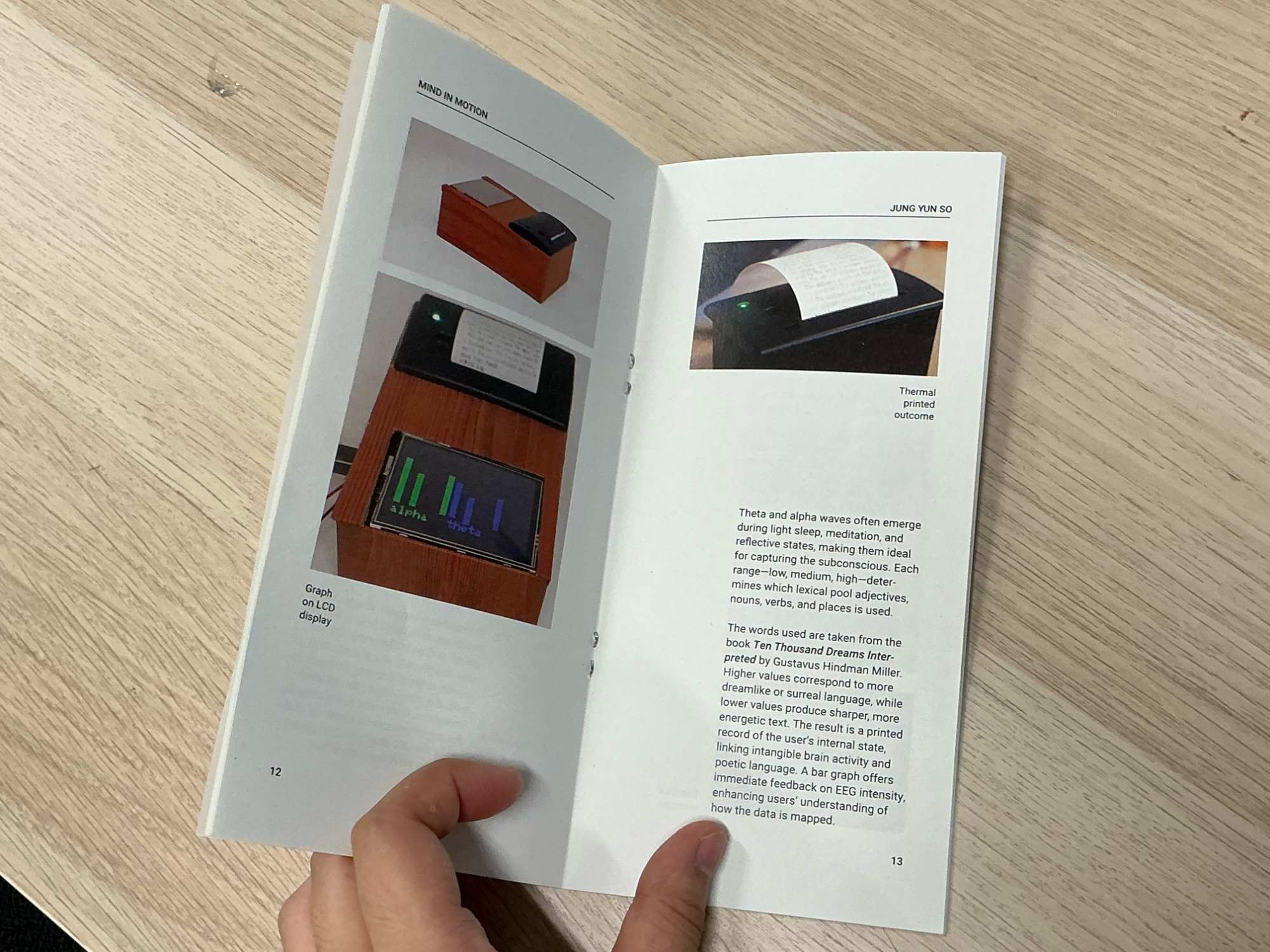
I chose an elongated booklet size (deviating from standard A6) to echo the proportions of receipt paper, creating a subtle visual connection to my thermal printer outputs. Inspired by a publication I admired, I used tracing paper for the cover, with the title visible but the interior contents only faintly discernible.
This creates an intriguing semi-transparent effect where the table of contents remains partially obscured, establishing hierarchy through opacity rather than stark contrast.I could balance immediate functionality with future development potential, while maintaining aesthetic consistency with my project's visual language.
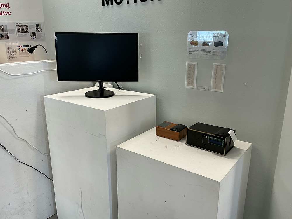
Laser Cutting Frames
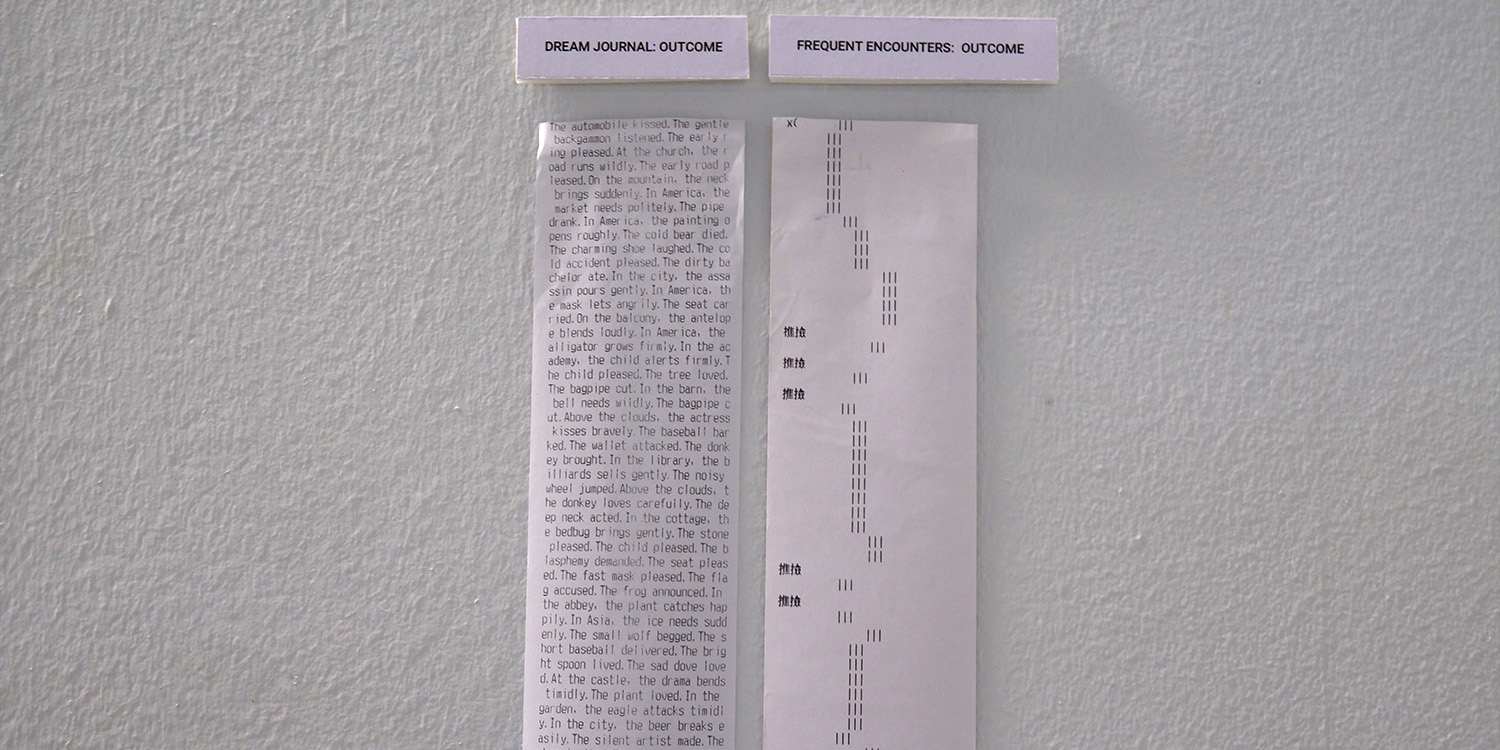
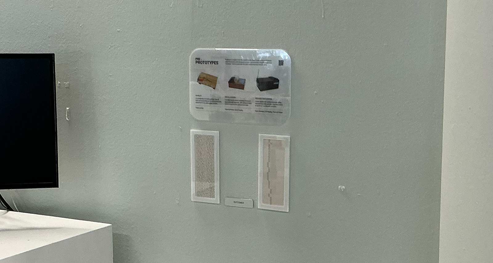
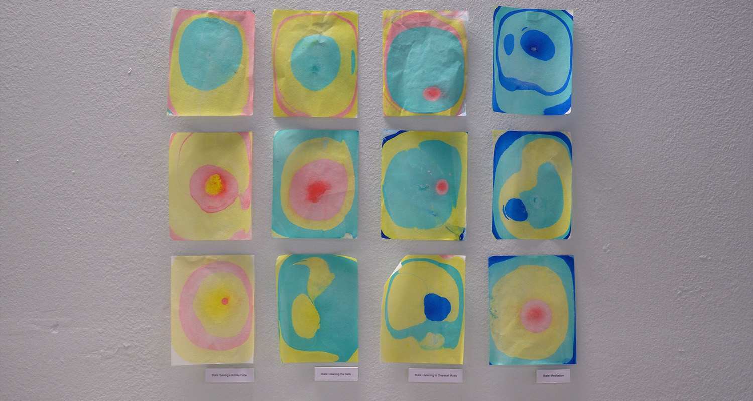
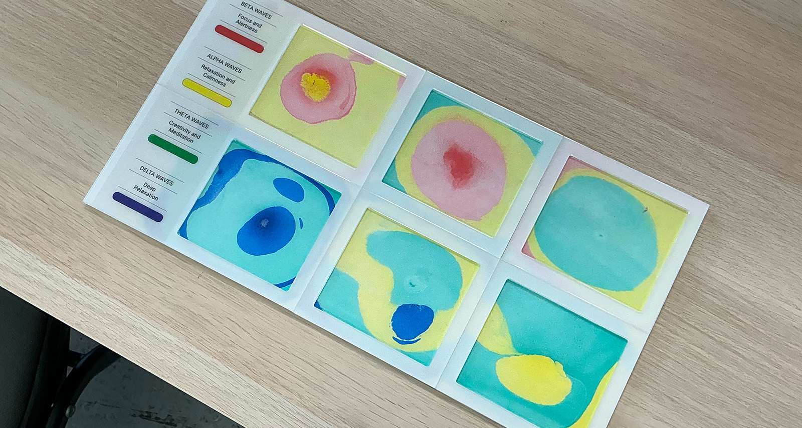
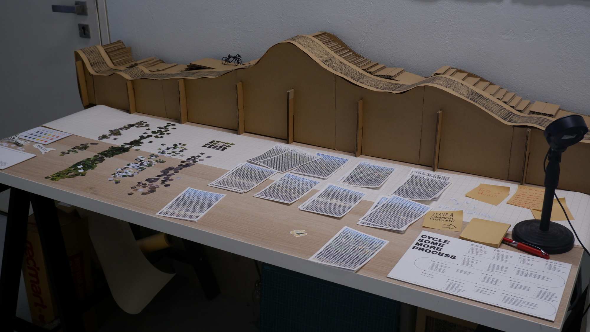
To demonstrate example outcomes for Open Studios, I laser-cut frames to display potential results. During semester one, outcomes were simply pasted on the wall - while this aligned with my project's aesthetic, I wanted a more polished presentation for the showcase.
I aimed for a clinical appearance that would match expectations for a brain activity project. By sandwiching transparent paper between acrylic sheets, I achieved an engraved look that appears sophisticated at first glance. The entire setup utilises acrylic components extensively.
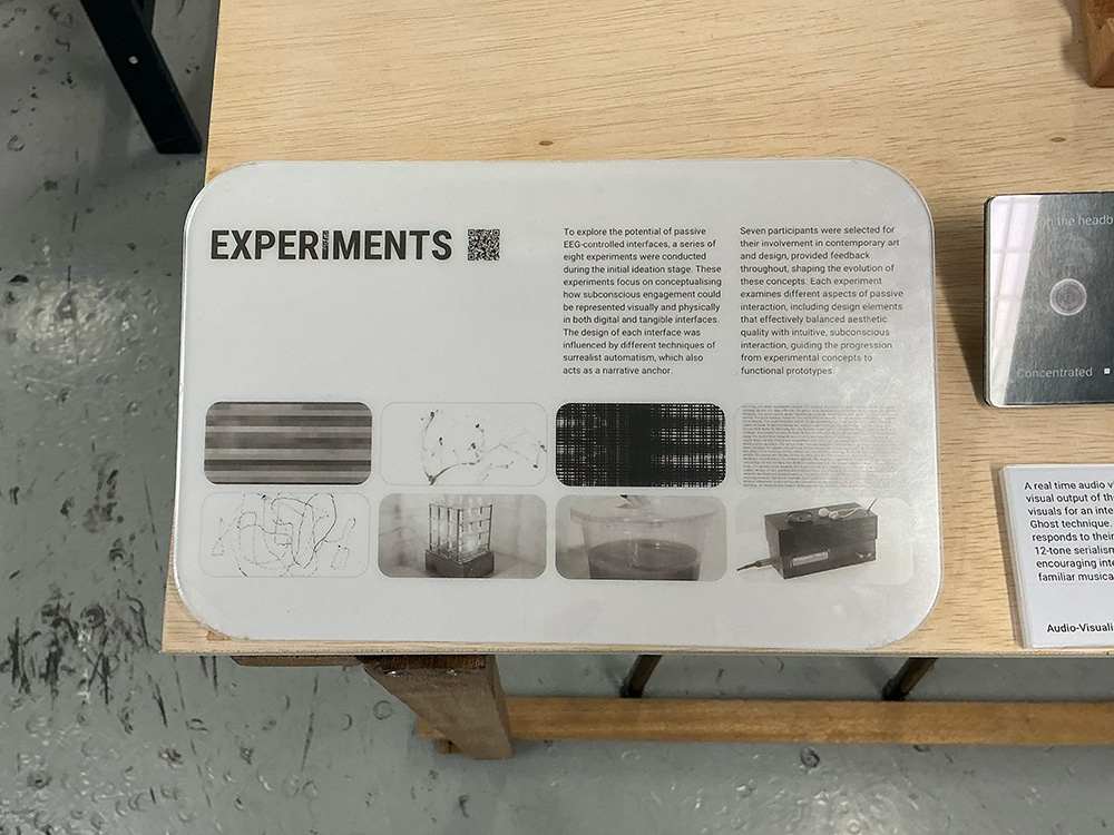
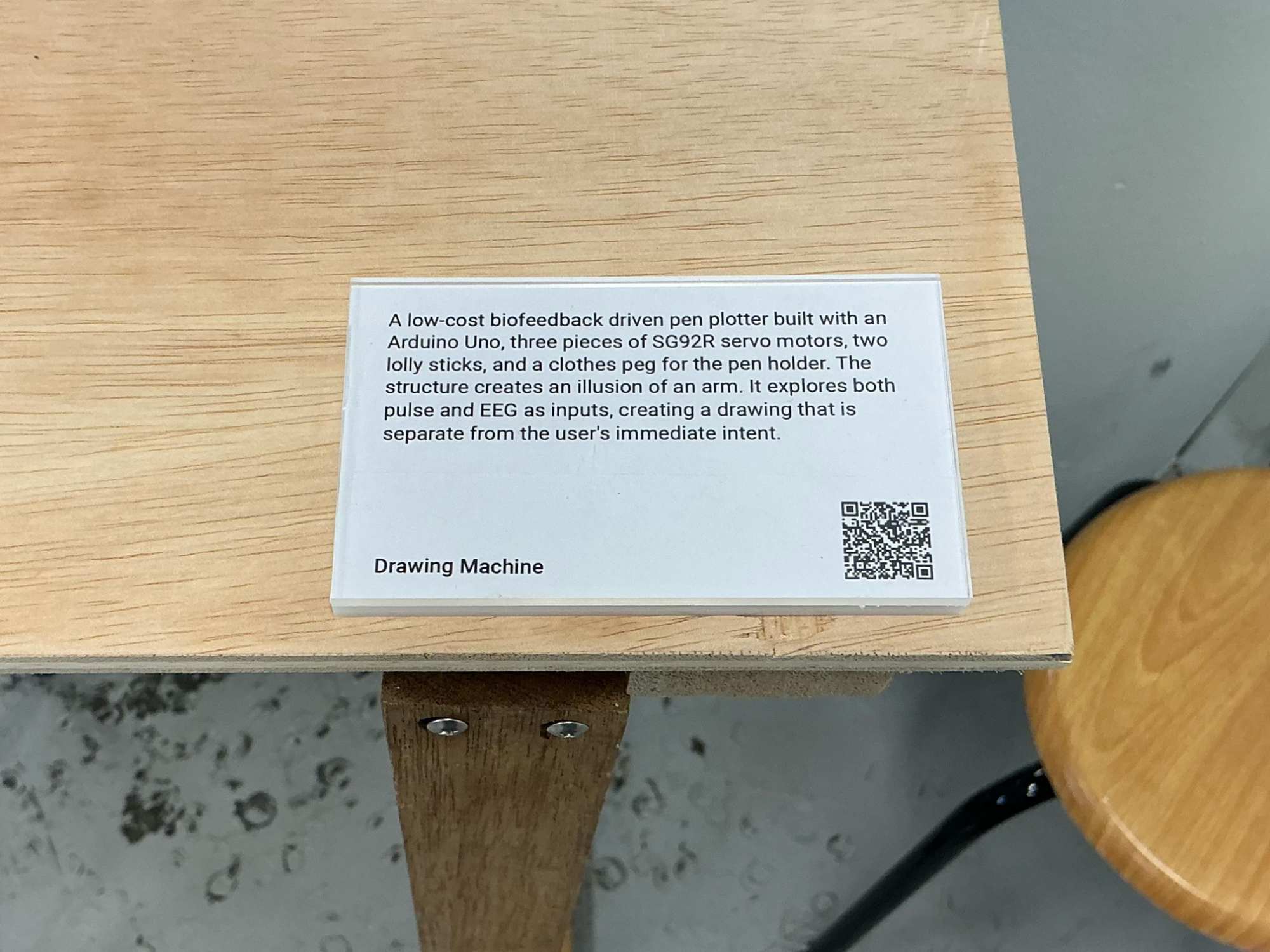
Also, I repurposed the leftover interior pieces from frame-cutting as description bases. This reduced material waste and lowered costs, making it economically efficient while maintaining visual coherence.
Curation
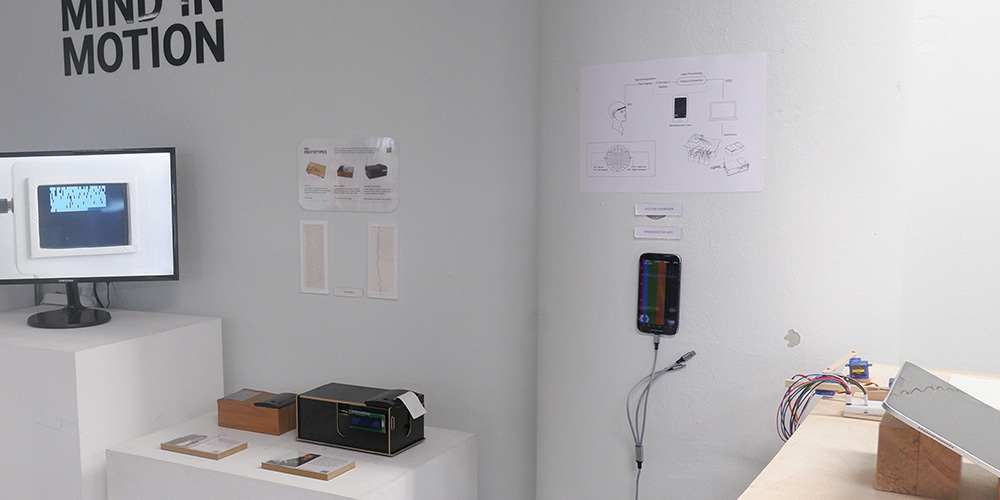
I faced several challenges when curating the setup. My primary concern was creating an intuitive user experience where viewers would naturally understand how to engage with the outcomes without explicit instructions or numbered guides.
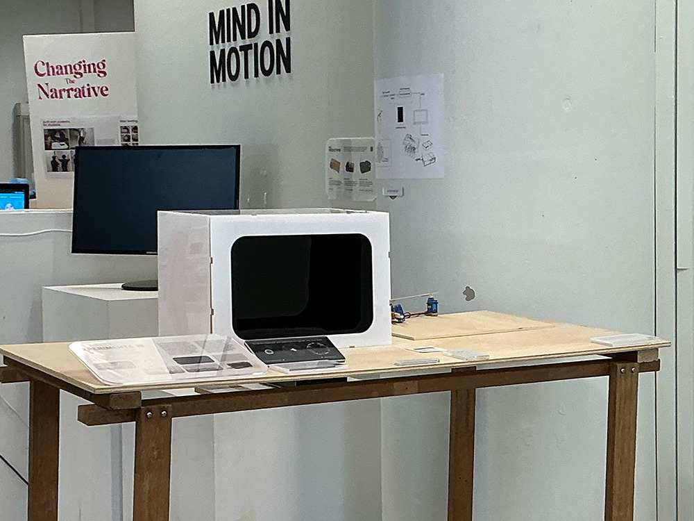
Initially, I positioned the most interactive elements—including the hologram box—in the most visible spot facing the entrance, ensuring they would immediately catch visitors' attention as they entered the studio.
However, this arrangement created uncertainty about where viewers should proceed next. The adjacent student's setup, which was quite lengthy, made it unclear where my exhibition began or ended. While not ideal, I had limited alternatives due to spatial constraints and aesthetic considerations.
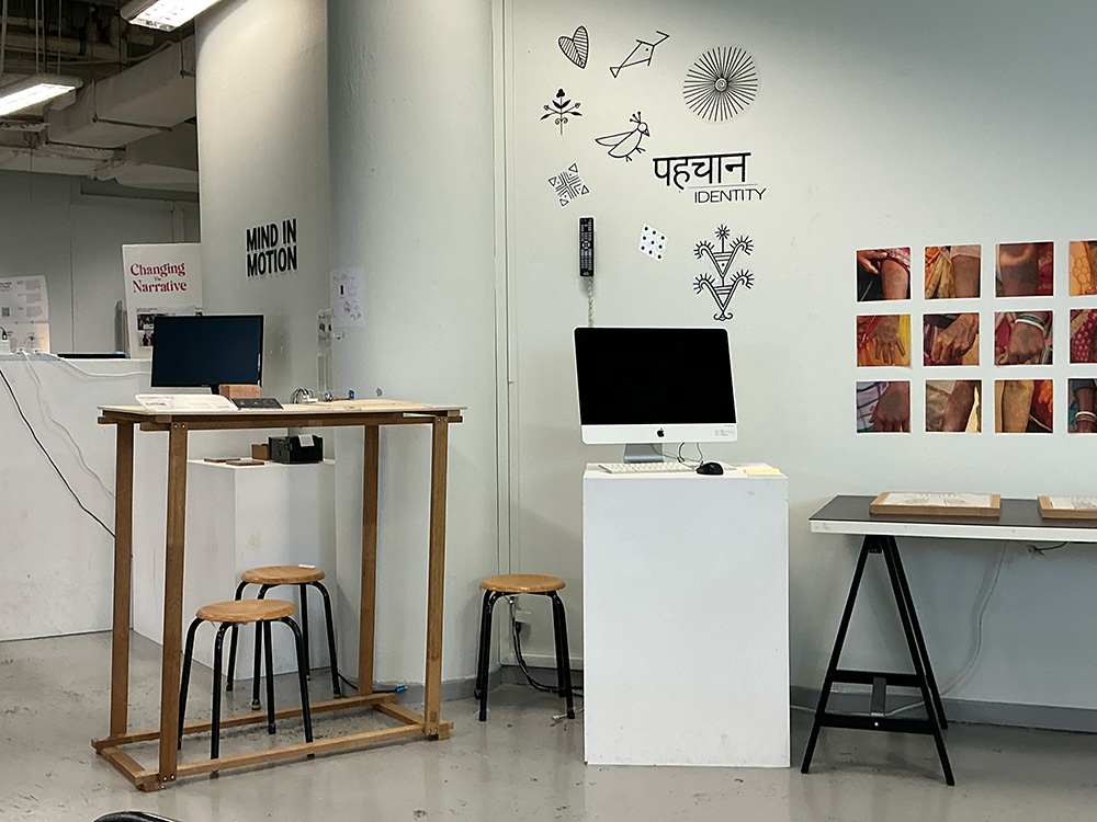
After reassessing, I considered placing my semester one outcomes along the outer edges of the setup. These pieces worked better on pedestals than tables, but moving them outward would require shifting my main table inward against the wall—an impractical solution given space limitations.
The only viable option became positioning the wooden table externally while keeping pedestals along the inner wall, similar to my semester one arrangement but now with an additional table. This also required some considerations for alignment to other components.
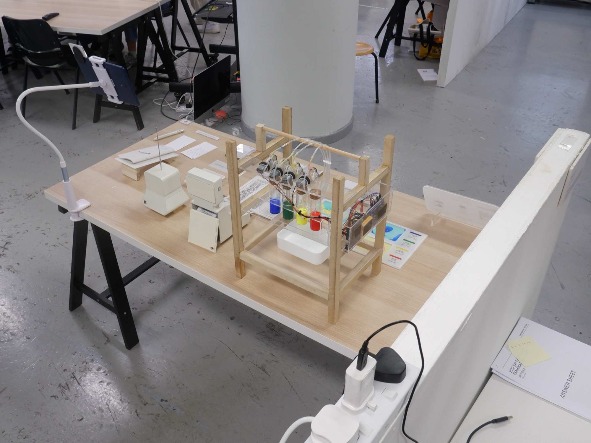
This layout was chosen because: key elements like the experiments and final interfaces occupied prominent positions, while initial outcomes remained in less central areas. All wiring was neatly attached to walls, and I had discrete spaces for my laptop and the accompanying app.
To enhance understanding, I included a system overview explaining the Mac and app's functions within the larger project framework. While not perfect, this solution best balanced functionality, aesthetics, and viewer experience given the available space and resources.
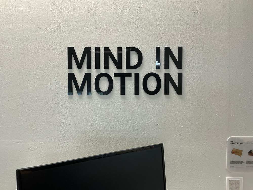
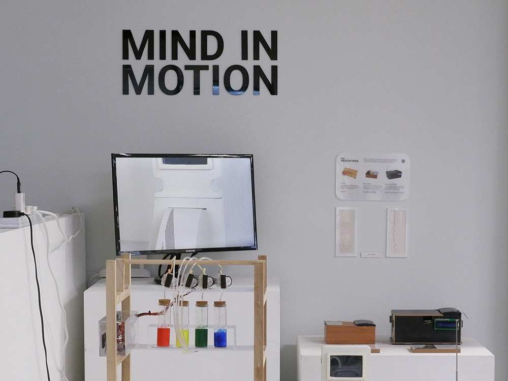
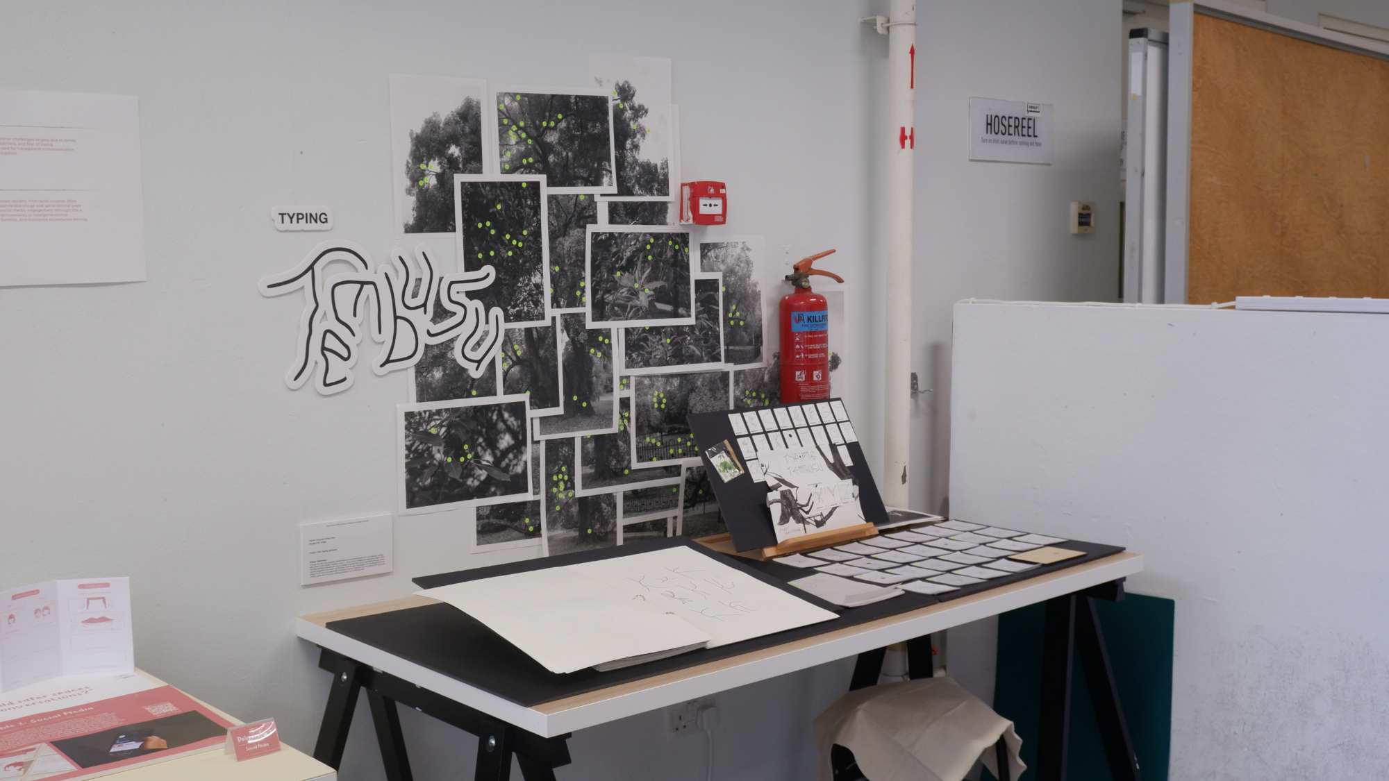
Additionally, I decided to display my project title in large letters on the wall. This idea was inspired by projects from Yasser's atelier, which focuses heavily on branding. They had pasted vinyl stickers on the wall, usually their titles or simple symbols that represent their theme. I wanted to add a similarly intuitive signifier into my own setup.
Using leftover black acrylic pieces from Pepper's Box, I laser-cut the title letters for wall mounting. I aligned these with the monitor display, which served the dual purpose of creating a clear visual boundary for my exhibition space. Something that helps viewers immediately recognise that everything within this defined area belongs to my project.
